

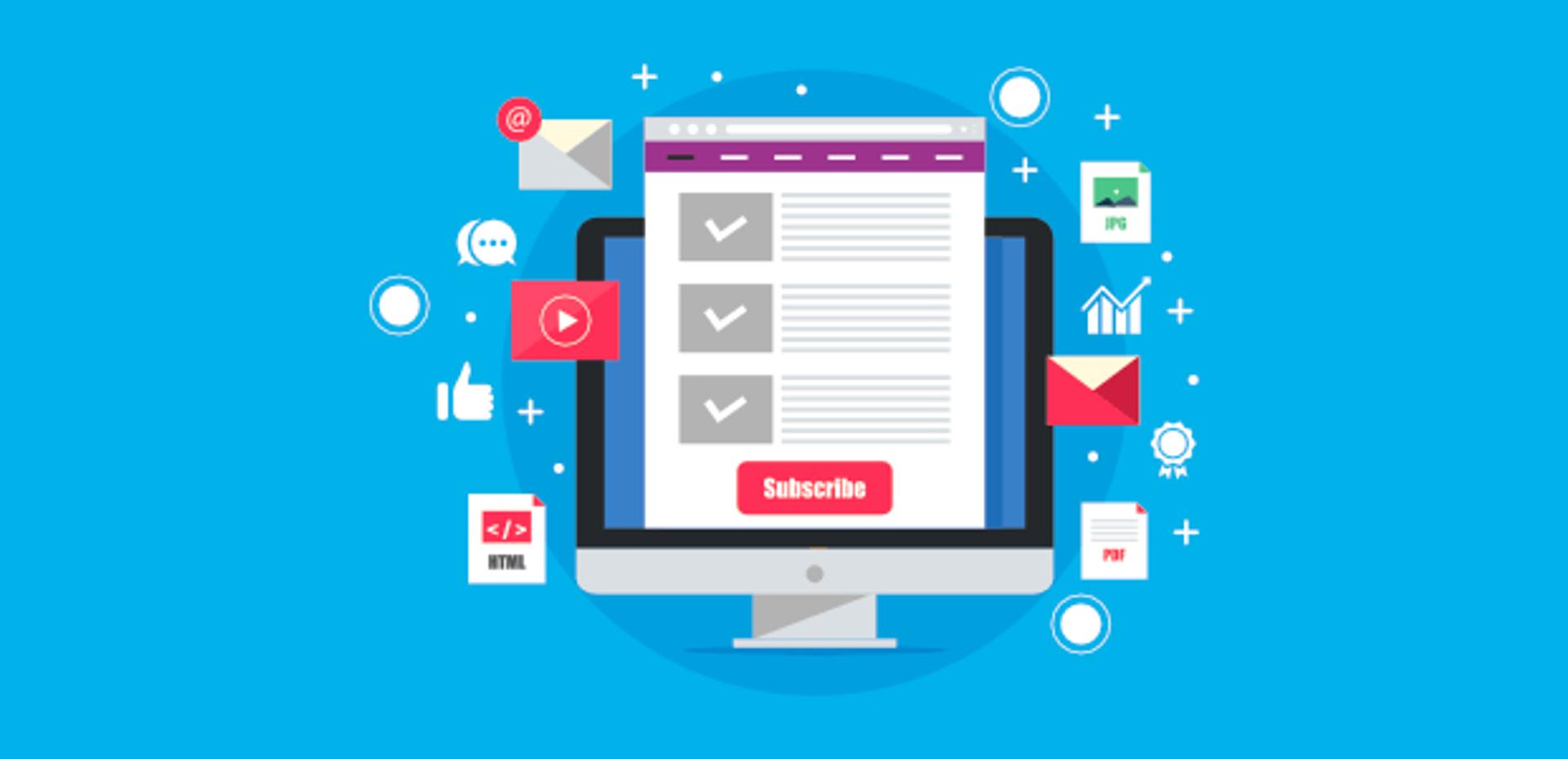
Calls to action (CTAs) are an important part of any landing page. They are the glue that keeps visitors to your page engaged and encourages them to take the desired action (sign up for a newsletter, start a free trial, or buy a product or service).
However, if you're not careful, your call to action can fall flat and leave potential customers feeling unmotivated to take any sort of action. That's why it's important to optimize your call to action to maximize the potential of your landing page. But how exactly do you do that?
Well, we've got you covered. This guide will cover all you need to know about optimizing your calls to action, from the basics of what they are and why they're important, to best practices for crafting the perfect call to action.


What Is A CTA (Call To Action)?
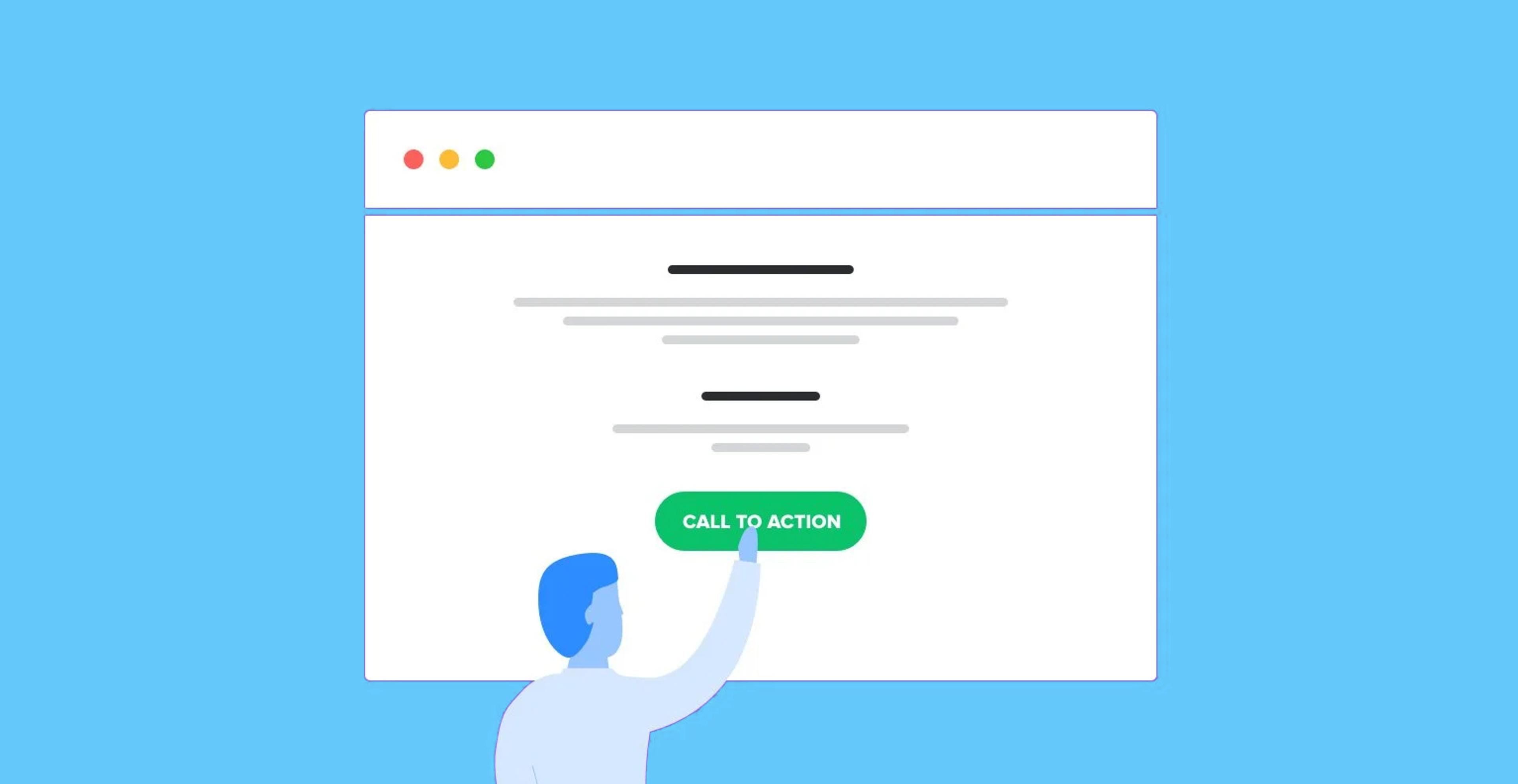
A call to action, or CTA, is a button or phrase with a clickable link that encourages readers to take immediate action. Usually, it tells readers what to do next: “Get Started,” "Subscribe Now," "Download Our Free Guide," or "Sign Up For Free."
Think of it as a signpost: the CTA guides readers through your content and points them in the right direction. In other words, it's a way to say, "Hey! Look over here and do this!"
But a CTA isn't just about pointing people in the right direction - it's also about motivating them to actually take action. Whether you want people to sign up for a newsletter, download an eBook, or try out a product or service, the CTA's job is to push people over the edge and get them to click.
How Does It Work?
A CTA works in two ways: first, it catches the reader's attention and compels them to take action. Secondly, it places clear instructions in front of them, making the action easy and straightforward.
When a website visitor clicks a CTA, they are typically directed to a page that further explains the offer and allows them to take advantage of it. For example, if a CTA is for a free newsletter signup, the reader may be directed to a page with further information about the newsletter, as well as a form that allows them to subscribe.

Build, test, and iterate on Shopify without the dev time
Replo has hundreds of templates to help you launch and test new landing pages - without writing a line of code.
Why Are Calls To Action Important For Your Landing Page?
Landing pages are a great place to showcase what your business offers, but without a call to action (CTA), visitors will likely leave your page without taking any action. A CTA is what entices them to stay, explore further and, ultimately, take the desired action.
Incorporating CTAs into your landing page can help:
Grow Your Subscriber List
Any business that wants to grow and reach more people needs a bigger subscriber base. By including a CTA on your landing page that encourages visitors to subscribe to your mailing list, you can start building a relationship with them and keep them updated on what’s happening at your business. Action phrases like “Sign Up Now” or “Subscribe Today” can help your visitors take the first step towards becoming a customer.

Increase Conversions And Sales
The ultimate goal of a landing page is to convert potential customers into paying ones. By including a CTA with a phrase like “Buy Now” or “Get Started,” you’re making it easier for customers to take the next step in the purchasing process.
Encourage Social Sharing
If your visitors are excited about what you’re offering on your landing page, they’ll likely want to share it with others. Including a CTA with phrases such as “Share Now” or “Tweet Now” can motivate visitors to help spread the word about your business.


How To Optimize Your Call To Action For Your Landing Page
As we have seen, calls to action are a powerful way to engage and convert website visitors. But crafting the perfect CTA is no easy task - it takes some thought and strategy.
Here are a few tips to help you optimize your CTA for maximum effectiveness:
Make Your CTA Visually Appealing
Your landing page CTA should stand out from the rest of your page. A page visitor should be able to quickly identify your CTA and what it's asking them to do. Having a visually appealing CTA is the most effective way to draw attention and get clicks.
Here are some design tips to make your CTA stand out:
Have Your CTAs Be In Form Of A Button
Buttons catch a user’s eye more than text links do. In fact, CTA buttons are so important, essential, and overwhelmingly powerful that you should only consider CTA buttons as the only way to express the action of your page.1

Add Symbols That Indicate A Consequent Action
Using action-oriented symbols like arrows, pointing hands, keys, and shopping carts can be helpful in indicating a call to action. Make sure to use something that will resonate with your visitors.
Use Shadows And 3D Effects
When users drag their cursor over a flat CTA, it’s hard to tell if it’s clickable or not. Incorporating shadows and 3D features will not only make your CTA stand out more but will also make it easier for users to identify it as clickable.
Utilize Whitespace Around Your CTA
Whitespace helps draw attention to your CTA as well as gives the user more space to click on it. If you have a lot of content and visuals on your page, make sure to leave sufficiently sized whitespace around your CTA, so it doesn’t get lost in the shuffle.


Create A Sense Of Urgency
The fear of missing out (FOMO) is a powerful motivator that helps nudge users to take action. Try creating a sense of urgency in your CTA to encourage visitors to act now before they miss out on the offer.
Here are some ways to create urgency in your CTAs:
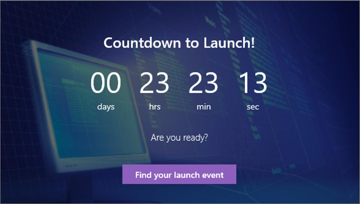
Incorporate A Countdown Timer
Adding a dynamic countdown timer to your CTA creates an urgency of time. Visitors will feel like they have to act fast in order to benefit from the offer.
Use Words Like “Last Chance” And “Today Only!"
Such words evoke a sense of urgency and make the offer seem like it’s limited in time. Keep in mind that this type of language needs to be used sparingly, or it can have the opposite effect.

Personalize Your CTA
Personalized CTAs convert 202% better than basic CTAs.2 Personalizing your CTA means using the language that resonates with each visitor and speaks to their individual needs. For example, if you know that your visitor has viewed a particular product or category on your website, tailor your CTA to the product they’ve been viewing. This will make your CTA more relevant and engaging.
Place Your CTAs Above The Fold Strategically
When crafting your CTA, it’s important to think about where you will place it on the landing page. Make sure to place your CTA above the fold, meaning it should be visible on the page without scrolling down. This will ensure that users see the CTA without having to look for it.
The placement of your CTA should also be strategic. Place the CTA near key points in your content or visual, and make sure it’s aligned with the goal of the page.
Also, ensure your CTA is not surrounded by too many other visuals or distracting elements, as it could dilute its impact.
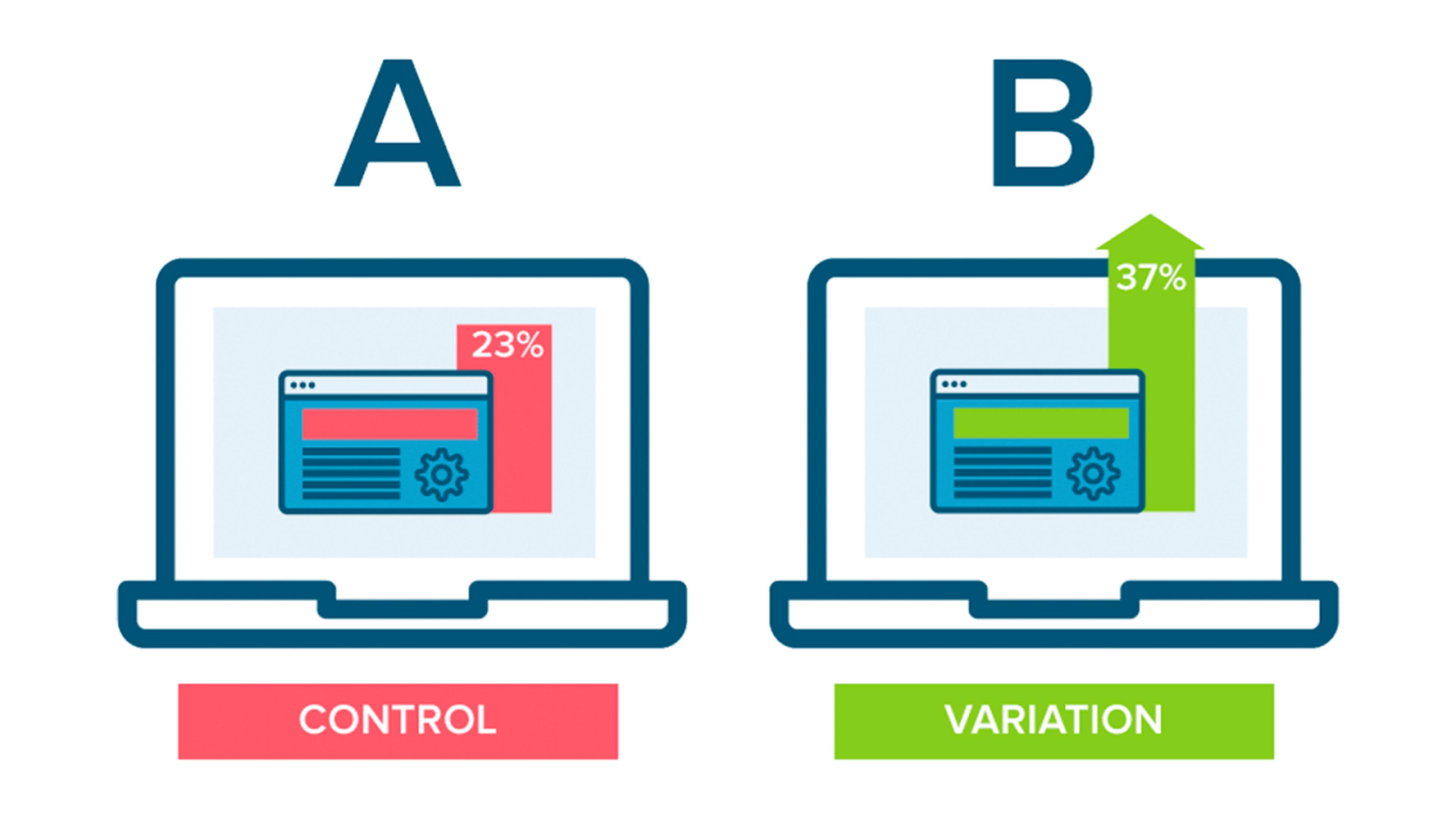
Test And Refine Your CTA
Coming up with the right CTA is a process of trial and error. Try testing different variations of your CTA to see what works best with your audience.
A/B testing is a great way to figure out which CTA resonates best with your visitors. A/B testing allows you to compare different versions of your CTA and monitor which one is more effective.
Once you have identified which CTA works best for your target audience, it's important to refine it continuously to ensure maximum engagement. This might include changing your CTA's color, wording, design, or placement to optimize it further.
Use Contrasting Colors To Make It Pop Out
Contrasting colors can help draw attention to your CTA. Make sure to adjust the colors of your CTA and its background so there's enough contrast for it to stand out on the landing page.
Also, make sure to choose colors that match your brand identity and align with your landing page's tone. You can use a color wheel to identify which colors are on the opposite ends of the spectrum yet complement each other.
Make Your Audience Curious
Creating curiosity helps grab people’s attention and motivates them to click on the CTA. Use words that make people curious, like “Join Community,” “Discover More” or “Learn How,” as it will make them want to find out what comes next.
You can also use questions in your CTA to make people curious and draw them toward taking action. For example, “Want To Be Part Of Something Big?" This question evokes curiosity and encourages people to click on the CTA to find out more.
Write A Compelling Copy
The copy in your CTA should be direct and engaging. Keep it short, simple, and clear so that it's easy to understand. Spend some time crafting the copy for your CTA and use action-oriented words like “Book a Demo,” “Start Now” or “Sign Up” to drive the desired action.
Also, avoid using industry jargon and use emotional language that resonates with your target audience. Research shows that words expressing emotions can actually increase sales by 23%.3 Therefore, this is a great way to make your CTA more effective.
Match Your Landing Page And CTA Intent
Make sure your CTA is in line with the goal of your landing page. For example, if you have created a landing page to generate leads, ensure your CTA reflects that goal by asking visitors to “Sign Up” or “Create An Account.” This will help ensure a seamless user experience and make it easier for visitors to take the desired action.
Emphasize The Benefits Of Your Offer
Your CTA should focus on emphasizing the benefits of your offer rather than listing its features. People are more likely to take action if they understand the benefits behind it. Use words like “Start Saving” or “Grow Your Business” to make people understand the advantages of taking action. Make sure to keep the benefits concise and easy to understand, so it does not confuse your visitors.
Additionally, you can back up your CTA with customer testimonials or reviews to share the success stories of your existing customers. This will help create trust and further motivate people to take action.
Build, test, and iterate on Shopify without the dev time
Replo has hundreds of templates to help you launch and test new landing pages - without writing a line of code.
How To Measure The Effectiveness Of Your Call To Action
Measuring the success of your CTA is crucial to understanding whether or not it is successful. You can track the following metrics to measure the effectiveness of your CTA:
Click-Through Rate (CTR)
This helps you understand how many people clicked on your CTA after they saw it on your blog, email, or social media.
Submission Rate
Measures how many people clicked your CTA, then submitted a form on the CTA's URL redirect page.
By measuring these metrics, you can determine the overall success of your CTA and tweak it accordingly to make it even more effective.
Final Thoughts
It takes time and effort to craft an effective CTA, but it is worth the effort. With a few simple tweaks, you can make your CTA stand out and drive more conversions. Follow the tips mentioned in this post to create an effective CTA for your landing page and make the most out of it.
Also, if you want to take your marketing efforts a step further and get the most out of your landing page (especially for Shopify landing pages), Replo can help! We offer pre-built Shopify landing pages that are optimized for conversions and can be customized to fit the unique needs of your business.
Book a demo today and see how our landing page templates can help drive more conversions for your business!
Sources:
- Zheng, D., Eggspert, T., & Hogan, S. (2020, April 16). 8 characteristics of high-converting CTA buttons. The Daily Egg. Retrieved from https://www.crazyegg.com/blog/high-converting-cta-buttons/.
- Vocell, J. (2022, May 6). Personalized calls to action perform 202% better than BASIC ctas [new data]. HubSpot Blog. Retrieved from https://blog.hubspot.com/marketing/personalized-calls-to-action-convert-better-data.
- We're ruled by our emotions, and so are the ads we watch. Nielsen. (2022, July 21). Retrieved from https://www.nielsen.com/insights/2016/were-ruled-by-our-emotions-and-so-are-the-ads-we-watch/.