

If you have only used your product pages up until this point to sell your goods, you are missing out. eCommerce landing pages serve, in the majority of cases, only to persuade visitors to take advantage of an offer by selling physical goods.
However, the offer by itself is insufficient to turn leads into paying customers. To draw attention, you must include certain components when creating a landing page for an online store, such as a headline, hero image, social proof, and a call-to-action button. All the information your audience requires to take you up on your offer will be provided by these elements.
In this article, we will look at what an e-commerce landing page is, how it differs from your product page, and how to create one. As a bonus, we have also scoured the web for high-converting e-commerce landing pages that you can use for inspiration while creating yours.
What Is An eCommerce Landing Page?
An e-commerce landing page is a standalone web page, created specifically for marketing purposes. When a visitor clicks on a link, such as an advertisement on Google or a promotion in an email campaign, they "land" on this page.
The main goal of e-commerce landing pages is to persuade visitors to accomplish a predetermined task. This primarily refers to making a purchase in e-commerce.
The page encourages customers with a clear call to action and is customized to the buyer's intent (CTA). Engaging headlines, top-notch images, clear copy, and social proof components like client endorsements and user reviews are all included in the page content.
To shed more light on the goal and functionality of e-commerce landing pages, let's use a hypothetical scenario.
A customer may be planning a trip soon and want to buy new luggage, so they search "best luggage for travel" on Google. They select the link labeled "The Perfect Luggage for the Modern Traveler" from the search results.
When they arrive on the page, they see a headline that corresponds with the ad and pictures of contemporary luggage. A CTA button that offers a discount code good for 30% off is also present. A money-back guarantee, customer testimonials, and subheadings that highlight the suitcase's durability are also present on the page.
The page provides the exact product the customer was looking for, and the additional social proof increases visitor trust and persuades them that these suitcases are of the highest caliber. Additionally, they can't resist the chance to save 30%, so they click the CTA button to start shopping right away.
In this case, it didn't take long for the shopper to find what they were looking for. The content of the page matched the buyer persona, included crucial product features, increased customer confidence, and made it simple for the customer to make a purchase. The website succeeded in turning a visitor into a potential customer as a result.
And this is the purpose of landing pages—to turn visitors into paying customers.

Build, test, and iterate on Shopify without the dev time
Replo has hundreds of templates to help you launch and test new landing pages - without writing a line of code.
eCommerce Landing Pages vs. Product Pages
Before delving into the specifics of eCommerce landing pages, it's critical to understand how they differ from other pages on your website and the potential effects this may have on your efforts to improve conversion rates (CRO).
Landing pages are for conversion, whereas product pages are more informational. As a result, each page makes use of a variety of elements to aid in realizing its purpose.
Here is a summary of how product pages and landing pages differ from one another:
Landing Pages
- Contains only 1 clear CTA
- Removes additional pathways such as site navigation
- Content is written around one goal, for targeted audiences
- Includes product descriptions (again, written for specific audiences)
- Optimized for marketing campaigns, not necessarily SEO
Product Pages
- Contains a distinct CTA but may also contain several CTAs
- Includes additional access points like the site's menu and its product categories.
- General content that is written for the masses
- Includes product descriptions and product recommendations
- SEO-optimized to draw in organic traffic
Let's use the aforementioned example to demonstrate the distinction between landing pages and product pages.
If a customer's search for "best luggage for travel" directs them to a product page, they will find general product details for one suitcase along with an order button. Additionally, the site navigation includes links to other suggested products as well as categories like "Laptop Cases" and "Handbags."
Contrarily, if the search leads them to a landing page, they will see text about contemporary, robust suitcases and a single CTA button for a 30% off discount on their purchase. There is no site navigation, and other products that the website sells are not highlighted.
Both have a CTA that entices customers to make a purchase using this example.
The product page, however, is more broad in nature. It serves as the site's introduction and provides paths for visitors to take. There are various CTAs available in the event that some customers are unsure about making a purchase right away and instead want to learn more and weigh their options.
The landing page, meanwhile, only contains one message and one CTA. When a customer lands on the page, their intent is satisfied because the message is directly related to the search terms. There is a direct path to achieving the conversion objective without detours because the offer is also directly related to this message.
Despite their differences, landing pages and product pages are both important for your website. They simply serve different functions in terms of your overall marketing initiatives. We'll go over the significance of landing pages and why your e-commerce site needs them below.
Why Landing Pages Are Important For Your Ecommerce Site
A crucial component of the sales funnel are e-commerce landing pages. It serves as a conduit between the first time a customer sees one of your marketing campaigns and the time they make a purchase at your online store.
Effective landing pages can also improve other facets of your overall marketing strategy.
For your e-commerce site, you need landing pages for the following 4 reasons:
Can Target Specific Consumer Groups
You can more effectively target particular clients if you have a number of personalized landing pages.
Create your landing pages with particular customer segments in mind. Which aesthetic is most appealing? What value claims do they require? What CTA causes a reaction?
The text of the CTA button and even the headline should match the buyer persona. For instance, a landing page for an email campaign aimed at Gen Z should be mobile-friendly since that group prefers mobile devices.
Customers are more likely to stay on your website and click your CTA if you can establish a strong connection with them.

Quick And Simple To Assemble
It might seem like an overwhelming amount of work to create numerous landing pages, each tailored to specific marketing campaigns and customers.
But it's not necessary to be. With the aid of a landing page builder, you can quickly alter various page components. Additionally, you can use ready-made themed templates to save yourself the trouble of creating pages from scratch.
The reward is worthwhile as well. That's because having more landing pages is beneficial. In fact, according to Hubspot, having 10-15 landing pages can boost your lead generation by 55%.1
Drive Higher ROI For Paid Traffic
The most effective online advertising may be on your e-commerce website. You could rule email marketing with high open rates and master PPC campaigns with astronomical click-through rates.
But what good are your leads if they never convert?
When they arrive at your e-commerce site, visitors who have purchased traffic have a specific set of expectations. They want to click on something connected to their search because they already have a specific intention.
You can meet these expectations by having landing pages built for marketing campaigns, which will increase the return on investment for paid traffic.
When someone searches for a "winter jacket" and clicks on an advertisement for it, they are likely to bounce if they are then directed to a homepage with other clothing items. They weren't able to find what they were looking for through this paid advertisement, and they didn't want to spend time browsing a website.
There is a greater chance they will stay on your website and perhaps even make a purchase if the advertisement directs them to a page with this season's winter jackets and a CTA to buy.
In other words, your advertising budget won't be wasted.
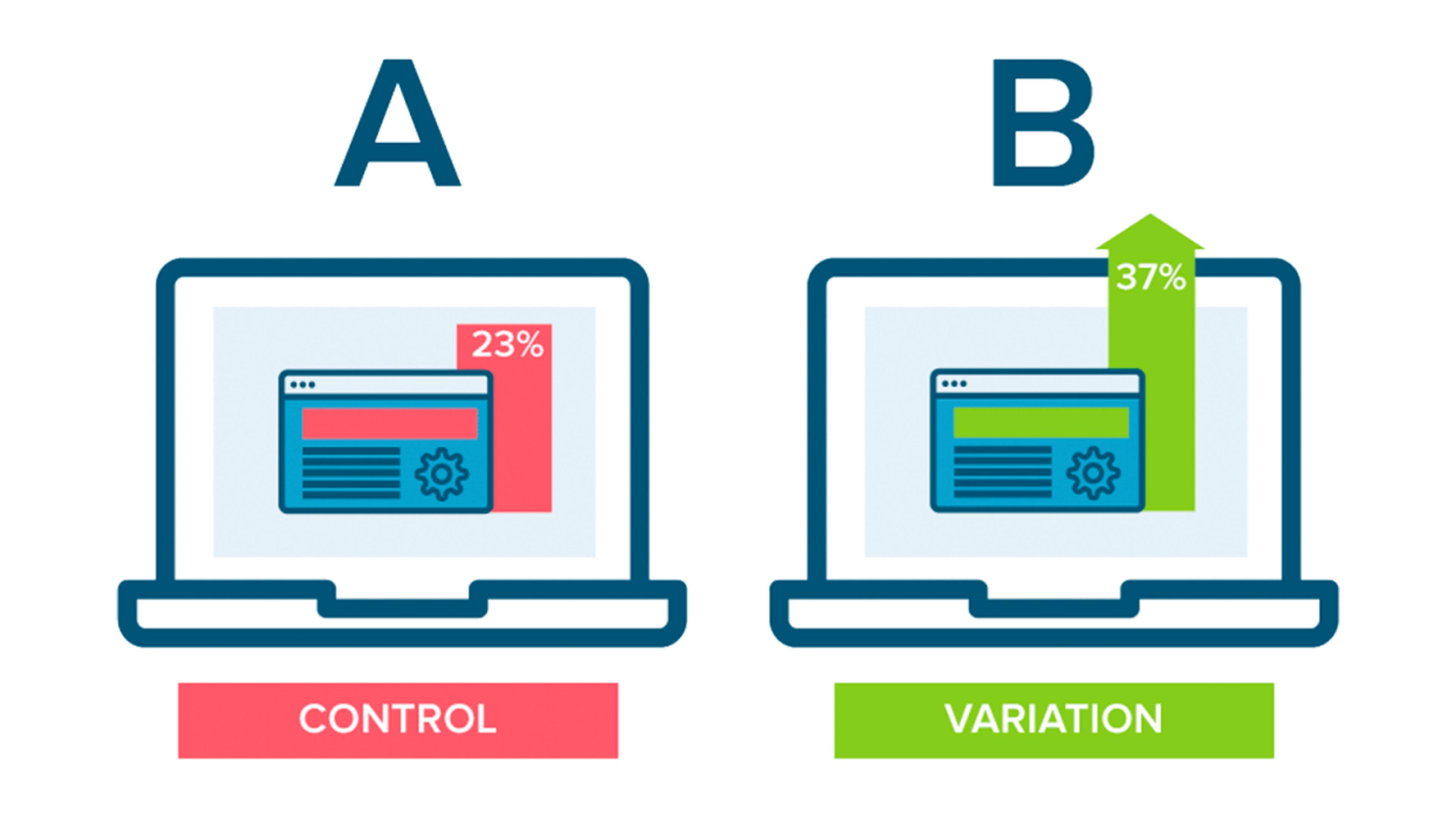
Great For Testing
Since landing pages are created for particular marketing campaigns, this is an excellent chance to experiment and figure out the most effective methods of reaching audiences.
Test your landing pages using an A/B split to see what works and what doesn't. Compare which CTA buttons receive the most clicks, which special offers prompt visitors to make an immediate purchase, and even which text color is more appealing.
The insights from a/b testing can be used in your other marketing initiatives in addition to helping identify which landing pages are converting best.

What Are The Three Types Of Landing Pages?
Hero Landing Page
Your landing page hero shot, which is the first image your visitors will see when they arrive, is the main image or video used to convey the value of your offer.
Consider the fact that includes both a credit card and a mobile app, which both provide context for their headline, "The credit & software your business needs to thrive.
The "above-the-fold" section of your landing page, or the area that visitors see first before scrolling down, is referred to as the hero section.
The hero shot and hero section refers to two different parts of your entire landing page, but your hero section also includes your hero shot, headline, subheading, and CTA (at a minimum).
Quiz Landing Page
A landing page quiz has a quick test with four to five questions and a contact form at the end. This tool's objective is to assist prospective clients in making decisions, participating in the procedure, and submitting a purchase order request.
Quizzes convert more frequently than conventional one-page landing pages. The audience is warmed up by quizzes, which is the reason. Compared to cold audiences who are asked to leave their contacts on an unknown website, these users are more likely to engage.
Why Quizzes Bring More Customers
Feeling Of Contributing
This is based on the idea that if a user puts time and effort into a particular solution (or product), it will be harder for them to reject whatever outcome they receive. Therefore, it becomes more difficult for your customer to give up and leave at the last step if they respond to 5 questions.
Fear Of Missing Out
This effect alludes to fear of misplacing or losing something important. In order to receive a discount for participating in a quiz, customers must provide their contact information
Confirmation Of Assumptions
You can display the survey results before the contact form at the end of the quiz. Consider making a recommendation for a good or service based on the responses users have provided.
Because you have established a high level of trust with them, they will be more likely to make a purchase from you. After all, the user confirmed what suits them by responding to their own questions.
Advertorial Landing Page
An advertorial page is a landing page that’s designed to look like an organic news story. Because these pages closely resemble the content of the native channel and match it, they are excellent for attracting cold traffic.
In this manner, readers gain value from the page and are prepared to make a purchase before they arrive at your sales page.
Every Advertorial Page Includes The Following Features:
Attention-Grabbing Headlines
An advertorial page copy's headlines are a crucial part. They are your first opportunity to entice visitors to read or watch the remaining pages.
Use a very effective headline technique that pinpoints customer pain points and makes use of them to grab users' attention and convince them to click on the desired CTA.
Building A Story
Landing pages for advertisements have just one main goal. pique a visitor's curiosity or draw their attention. A visitor is more likely to click through to the product page once they are enticed to read more.
And according to our statistics, visitors who click through from an advertorial landing page convert more often than those who do so directly from a native ad.
Irresistible Offer
For most businesses, it's all about wise investment choices!
In order to create offers that give customers the impression that they are getting the most for their money while still being viable for your business model, we have developed tested methods.
eCommerce Landing Page Examples
Below we’ve included some top eCommerce landing page examples to consider.

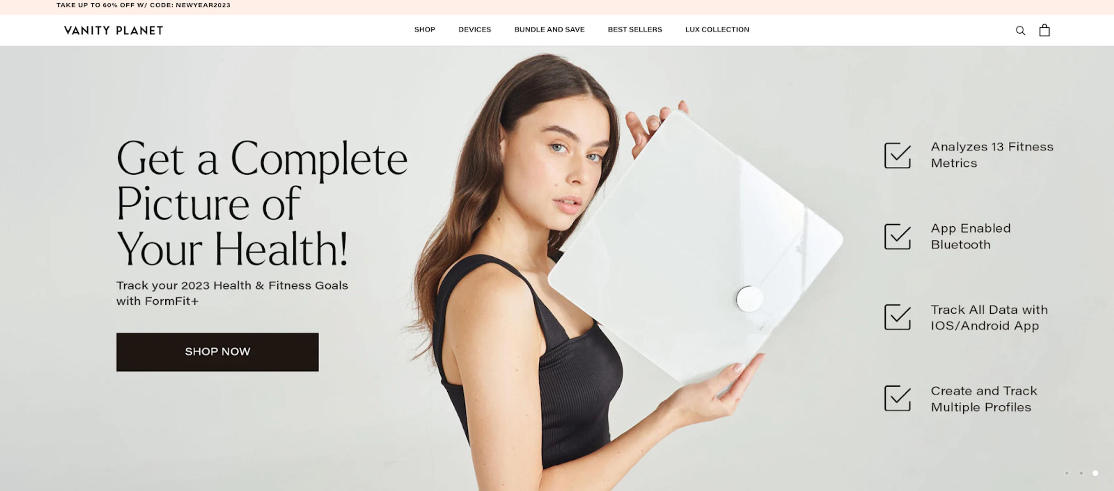
Vanity Planet
Vanity Planet’s landing page is a great example of how landing pages can be used for selling specific products. They wisely chose to focus solely on the Raedia Facial Cleansing brush rather than simply touting their entire line of products for your hair, health, skin, and well-being.
The subheading provides additional text that explains how the product can benefit their very specific target audience while the heading is brief and draws the visitors' attention. It merely demonstrates how you can create a landing page that works without having to make your company the main focus.
Additionally, intelligent use is made of white space that is used liberally. In addition to making the landing page easy to use, it also fits in well with the goal of the cleansing brush, which is to keep things clean.
The call-to-action button and social proof are the additional components that merit mention. The black text on a white background makes the call-to-action button stand out because of the contrast. It also makes it clear to visitors what action they should take next by using the words "Shop Now."
By mentioning the places where their product has been used, the item and brand are made to seem much more trustworthy. After all, the risk of using a subpar product that could possibly result in visible damage is simply too great when it comes to your skincare regimen.

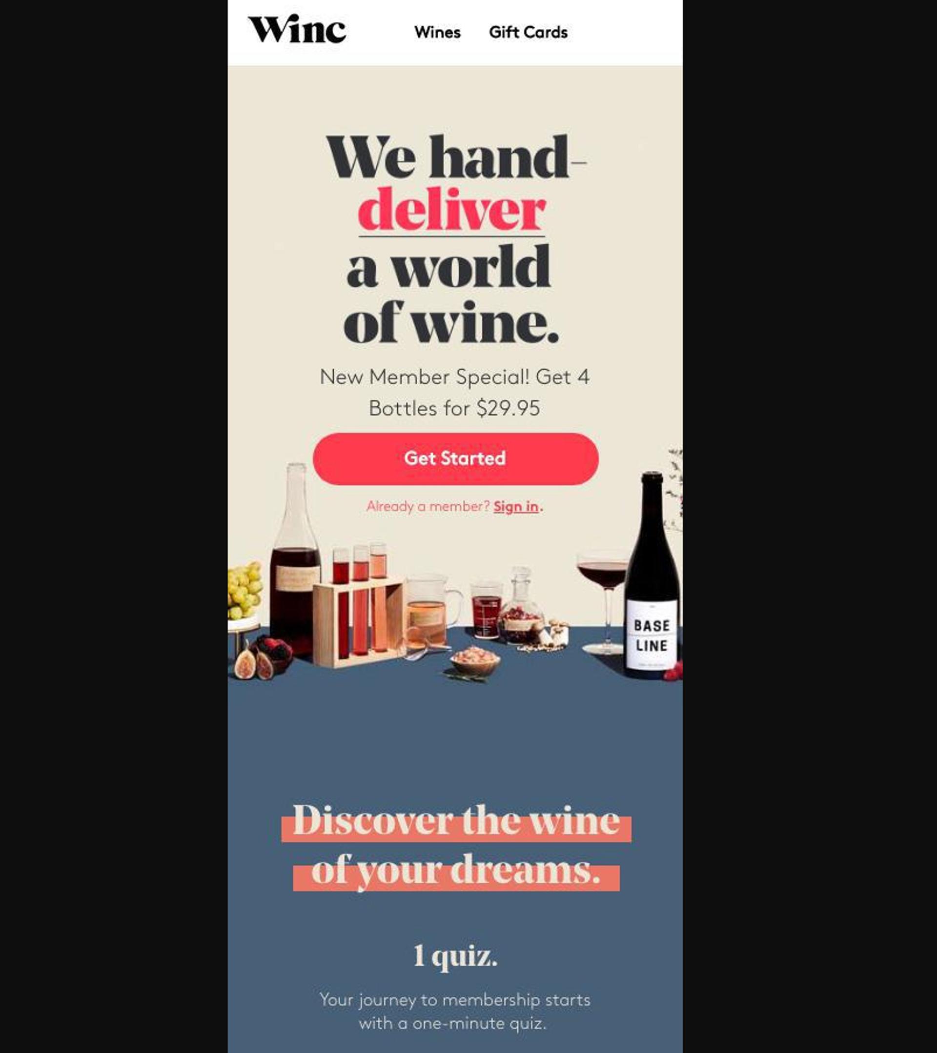
Winc
Winc, a winery that provides a membership experience online, has developed a few effective landing pages. They are able to create landing pages that stand out by using succinct but compelling headlines, a clear call-to-action button, and high-quality images of their various wines.
Because of how appealing and self-explanatory their products are, they can afford to rely more on images than on text. However, an actual source for the claim "#1 Personalized Wine Subscription" would have improved the landing page. This information is necessary for the social proof to have credibility.

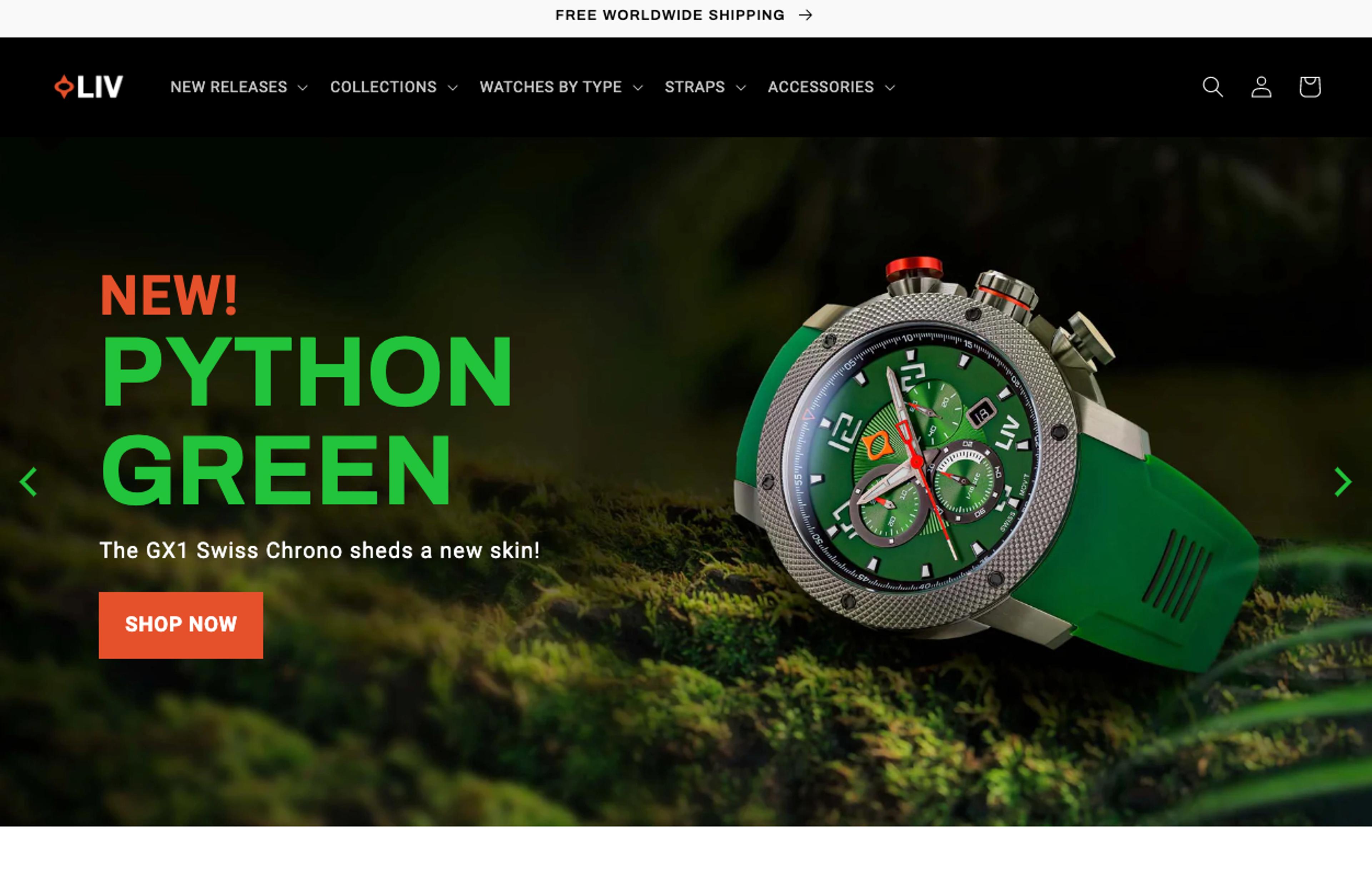
LIV Watches
The fact that LIV Watches has realized they must heavily rely on high-quality images to present their clothing in the best possible light is what makes their landing page so effective. So, rather than just adding a photo carousel (as most e-commerce stores do), they have used photos in a variety of ways on their landing page.
Their target audience is given a thorough understanding of their product and its various features by using pictures of their limited-edition wristwatch in various settings. The superior craftsmanship is also highlighted by the use of close-ups and a side-profile shot.
This landing page is a great example of how an e-commerce landing page can display products in different ways so that customers can see all the crucial information.

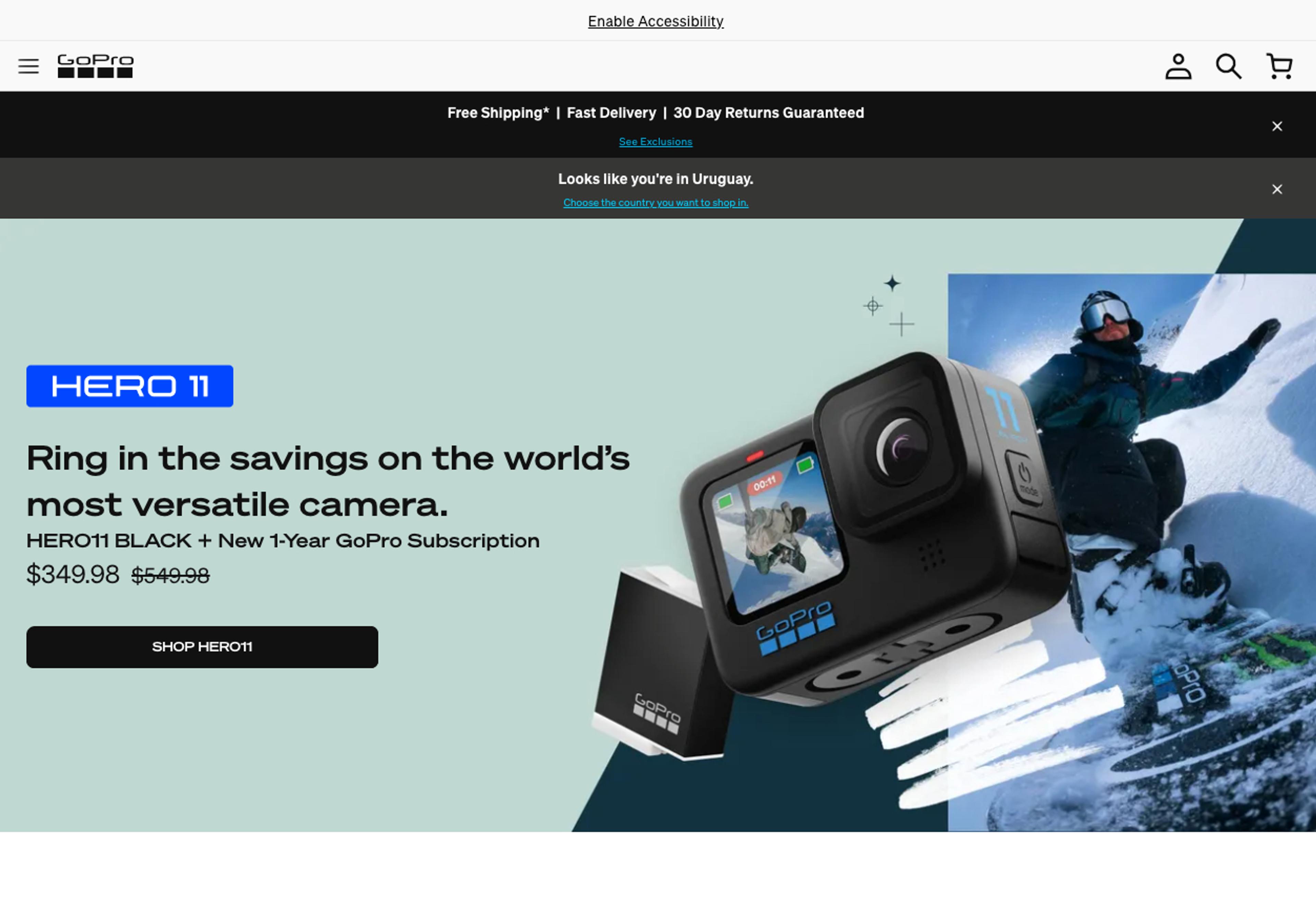
GoPro
In both of these landing pages, GoPro emphasizes the capabilities of their product with the help of strong, high-quality images. Their landing page's emphasis on images rather than text makes perfect sense given that their products are designed to take pictures and record videos. By taking this approach, the landing page makes it clear to the audience what high-caliber visuals their product is capable of producing.
Although there isn't much text, it does a good job of explaining the advantages to the audience. Focusing on what visitors will gain—smooth videos and first access to all the newest deals—instead of the brand is more effective.

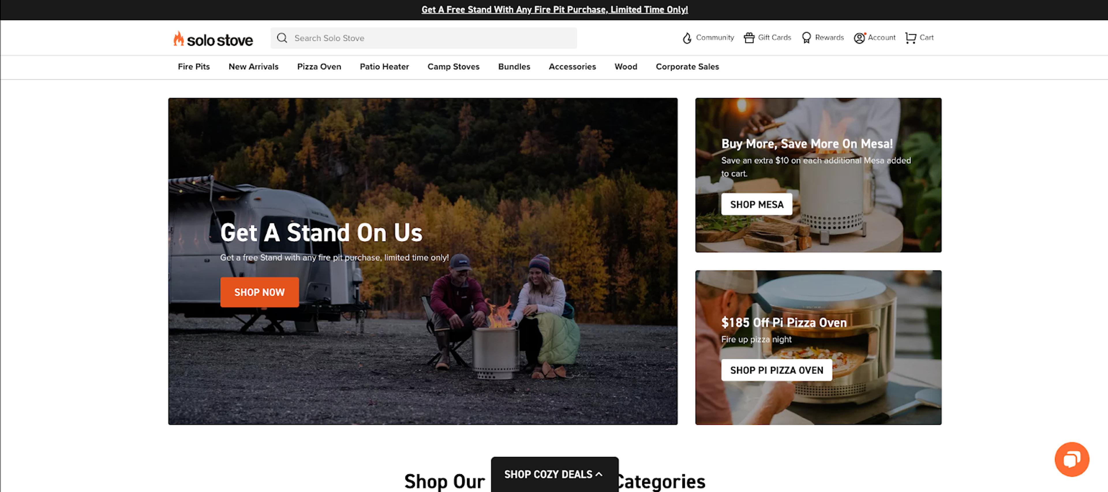
Solo Stove
Solo Stove’s landing page uses a combination of images and text to offer explanations of the features and how their products can benefit their potential customers. This is effective because long passages of text are frequently ignored.
Additionally, it successfully uses a lot of orange and black to match the vibrant tone of their outdoor cooking equipment. Additionally, using orange for the call-to-action button is a great choice because it makes this crucial component stand out.
The word selection increases the CTA's potency. By using "Shop Now" rather than, say, "Buy Now," the target market is expanded to include potential customers who aren't quite ready to make a purchase.
What Makes A Successful Landing Page?
A successful landing page includes the following elements:
Use Captivating Images
Images are important on landing pages because you have a limited amount of time and room to persuade visitors. After all, a picture really does speak a thousand words.
Utilize top-notch pictures that are appropriate for the landing page's goal. For instance, it would be beneficial to use product images if the page is focused on mid-funnel campaigns for specific products.
Make sure all of your images are mobile-friendly. especially given how frequently people use their mobile devices for e-commerce. Images should display without needing to zoom out or scroll down on the phone.
Images not only enhance visual appeal, but they are also crucial for establishing credibility. You can use social proof through images in the following ways:
- Testimonials that include the customer’s photo
- User-generated content of customers using products
- Media recognition and trust seals (i.e. As featured in….)
- Endorsements with pictures of the celebrity or influencer
Only use images that will enhance your landing page. Low-quality images that are pixelated, have poor lighting, or don’t fit with the content are better left off.
Build, test, and iterate on Shopify without the dev time
Replo has hundreds of templates to help you launch and test new landing pages - without writing a line of code.
You Want It To Have A Coherent Structure
A great landing page is uncomplicated and simple to navigate. This means keeping your page clean and uncluttered.
You don't want to lose a conversion because a visitor couldn't find the "Buy Now" button or was confused by too much text.
Following are some pointers for reducing clutter:
- Concise, to-the-point headlines
- Visible and clear CTA (more below)
- Removing site navigation links
- Relevant, high-quality images
- Bullet points for product details
Remember that a visitor can decide in a matter of seconds whether to stay on your site or leave. This implies that they won't likely sit down and read the entire page, especially if there is a lot of text.
They are more likely to scan the page to see if it matches what they are looking for. This implies that each page element matters and should have a clear reason for inclusion.
Don't add content merely for the sake of adding content; stick to the value proposition.
Include A Clear Call To Action
Visitors should be aware of your offer's details and how to benefit from it as soon as they arrive on your page.
Include a clear, visible CTA to achieve this.
Landing pages should only have one CTA, as opposed to other pages on your website. Giving customers just one option instead of letting them weigh their options makes it much easier for them to make a decision. This makes it ideal for conversions by moving visitors into the sales funnel more quickly and without interruptions.
The CTA ought to be clearly visible, simple to find and targeted at particular clients. You can achieve this by:
- Putting your CTA above the digital fold and at the top of the page
- Including multiple buttons for a single CTA throughout the page
- For button text, use active voice (i.e. Sign up for Free)
- Make it seem urgent or exclusive (i.e. Claim Your Offer Now)
Landing pages are excellent for testing, as we've already mentioned. For your CTA, this is especially true. The smallest adjustments can have a big impact. Test various CTA components, such as button text, button placement, button color, etc., on a regular basis.
Continuously A/B Test Landing Pages
There is no exact science to creating an e-commerce landing page because of all the different factors that are involved.
A headline that might not have been effective for a different audience. Multiple CTA paths as opposed to a single one may increase conversions. On mobile devices, images that appeal to desktop users might not have the same effect. Even choosing specific button colors increases engagement.
All of these variables may be tested once more. Pay close attention to important metrics like conversions between various iterations of e-commerce landing pages, visitor engagement, and bounce rates. Then, adjust your optimization.
Optimize For Mobile Devices
Mobile devices are being used for e-commerce transactions more and more. Every visitor, regardless of the device they are using, should have the same experience when visiting an e-commerce landing page.
For promoting your goal and CTA on mobile, there is a much smaller amount of space available.
Think about how your copy will appear in various layouts. Images should display without having to scroll or zoom out on the device. It is necessary to condense headlines so they fit on the page and don't take up too much space.
Test the effects of various content sizes on the speed and load time of your page. Large images will cause loading times to lag, which will cause visitors to leave.
Look at the appearance of your CTA. Still, one of the first things visitors see should be the CTA. It should also be straightforward and simple to complete on mobile devices. Long form fields are probably not going to do well on mobile.
Be sure to account for the conversion path's duration. For instance, it is likely that a visitor will give up if they are required to complete several steps with numerous page redirects.
Add Social Proof
Social proof is effective for e-commerce landing pages because it uses the experiences and actions of others to persuade potential customers. Content with social proof establishes credibility for new visitors and can influence the decision of current customers who are considering making a purchase.
- Reviews
- Testimonials
- Customer referrals
- Awards and recognitions
- Media mentions (i.e. As featured in)
- Influencer and celebrity endorsements
- Trust seals
- User-generated content
Social proof content can be utilized in headlines, subheadlines, CTA copy, and further down the page as support material. As an illustration, the headline "Our 5-Star Rated Product" could include a CTA to purchase the item. Another illustration of social proof in the CTA is a button that reads "Join the Crowd" next to copy that indicates how many people have purchased the product.
Let Replo Give You A Head Start
There are many benefits to having a good landing page, especially in the very competitive eCommerce landscape. However, to ensure its success, you need to get the design just right. By following the tips outlined above, you can create an effective and efficient landing page that will help drive conversions and ultimately benefit your business.
However, if you don't have the time or resources to design your own Shopify landing page, Replo can help! We offer a range of pre-built Shopify landing page templates that can be customized and tailored to your business's needs. These templates have been designed by our team of experts and are proven to drive conversions. Plus, they're backed by our 24/7 customer support to help make sure you get the best possible result from your page.
Schedule a demo today to find out how Replo can help you design the perfect Shopify landing page – and turn more visitors into customers!
Sources:
- Vaughan, P. (2022, October 10). Why you (yes, YOU) need to create more landing pages. HubSpot Blog. Retrieved from https://blog.hubspot.com/blog/tabid/6307/bid/33756/why-you-yes-you-need-to-create-more-landing-pages.aspx