Having a landing page can be very crucial for you to reach your marketing goals. Landing pages are not just useful tools but are a critical component of any brand's online marketing strategy.
You've created an irresistible product or service. You have done market research and know your audience will love and readily buy it. You may have created an amazing marketing campaign, the best ad copy, using the best headline, and gotten all your targeting right. Even with all these in place, if you have a poorly designed landing page, your marketing campaign may not achieve its objectives. A high-converting landing page may be all that is between you and your marketing goal.
In this article, we will walk through what a landing page is, why it is important to have one, and how to create a high-converting landing page. We will also talk about conversion, what a good conversion rate is, and how to craft call-to-actions that drive your landing page visitors closer to conversion.
Replo Reviews: How to create a high converting landing page
What Is A Landing Page?
A landing page is a stand-alone webpage created for a specific marketing campaign and aims to achieve a specific purpose. Landing pages differ from other pages because they are designed to achieve one goal and one goal only. It is this laser focus that sets them apart.
When visitors arrive at a landing page, everything is set up in a way that encourages the visitor to take a pre-determined action. This action could be anything ranging from signing up to an email list or purchasing a product.
One important feature of a landing page is that it is free of any distractions. This feature ensures that the visitor stays on course to conversion, and is not distracted by anything other than the reason for which the landing page was created.
What Is Conversion?
One of the major aims of a landing page is conversion. Therefore, to create a highly-converting landing page, you need to understand what conversion is.
To fully understand what a conversion is, let's examine an imaginary case study:
You're on Facebook and come across an ad for the best "Shopify landing pages". You've never heard of pre-built Shopify landing pages before, but you're intrigued by the prospect. So you click on the ad and are instantly transferred to a landing page, which you read with excitement growing inside of you with every sentence.
At the bottom of the page, there's a call-to-action that says, "download your free e-book to learn more." You click the button, enter your email address, and then get access to the ebook.
You might want to ask yourself, what just happened here? In sales and marketing terms, you have just been converted from a stranger into a viable lead. The people who sell these landing pages now have your contact information and can send you emails to promote their products and services.
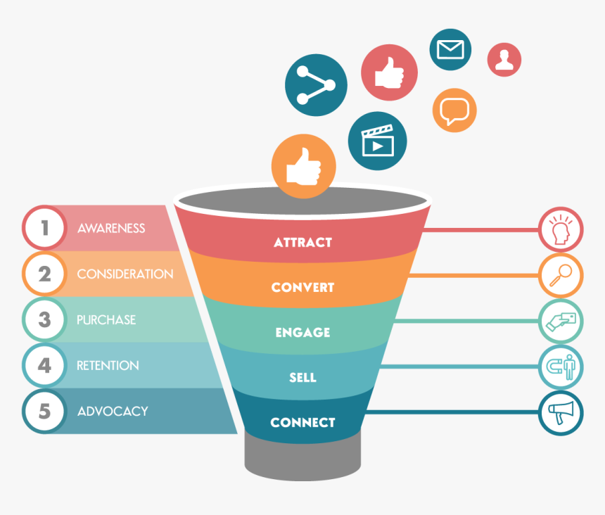
Therefore, a conversion occurs when a user progresses from one stage in a marketing funnel to another. You can also define conversion as an event that occurs when a user or website visitor takes a desired goal on your landing page. This goal could range from filling out a form ( i.e. lead generation) to making a purchase.
What Is A High Converting Landing Page?
A high-converting landing page gets a reader to take the desired action. Unlike general web pages, visitors usually land on a landing page after clicking on a paid ad, social media post, link in an email, or some other external source.
What Do High Converting Landing Pages Have In Common?
Landing pages that convert are as different as the people looking at them. Each one has a different call to action to drive, a different reader in mind, a different product or service to offer, and a different niche to address.
However, the most effective landing pages have one thing in common, they convert traffic. Whatever your marketing objective is, whether you're promoting an eBook or a free consultation, you know your landing page is effective when it converts visitors.
There are a few elements that high-converting landing pages have in common.
No Menu or Navigation Links
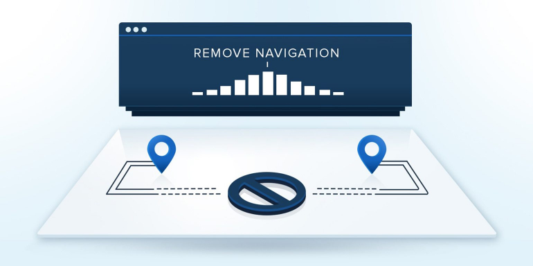
As mentioned earlier, landing pages are designed to avoid distractions. This is one way to achieve this. Data reveals that navigation links are a distraction on landing pages. Hence high-converting landing pages are without navigation links.
A Single Call To Action
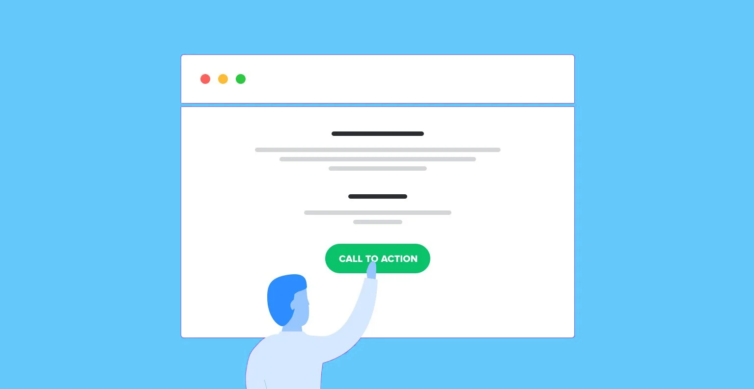
Just like the absence of navigation, a single call-to-action helps keep your reader focused. It increases the likelihood of them taking the desired action as they're not confused as to what to do. The logic behind this is simple, when people are given too many choices, they tend to take longer (and are less likely) to make a decision.
A Captivating Headline
Your headline is one of the first things a visitor will see on your page, hence it is important to make sure it captures your offer.
High-converting landing pages have the benefits they offer clearly stated in the headlines.
How Do I Create A High Converting Landing Page
Before you even begin to put your landing page together, you need to define what you want it to accomplish. Are you looking to generate leads? Sell a product? Promote a discount on a subscription service?
After clearly defining your goal, think about what your message will be and how what you're offering will solve someone's problems.
Now you can proceed to start your keyword research. This will be very useful when you're launching your ad campaign. What do people type in when searching for the solution you're offering?
The following are the elements to consider to create a high-converting landing page.
Pay Attention To Headlines
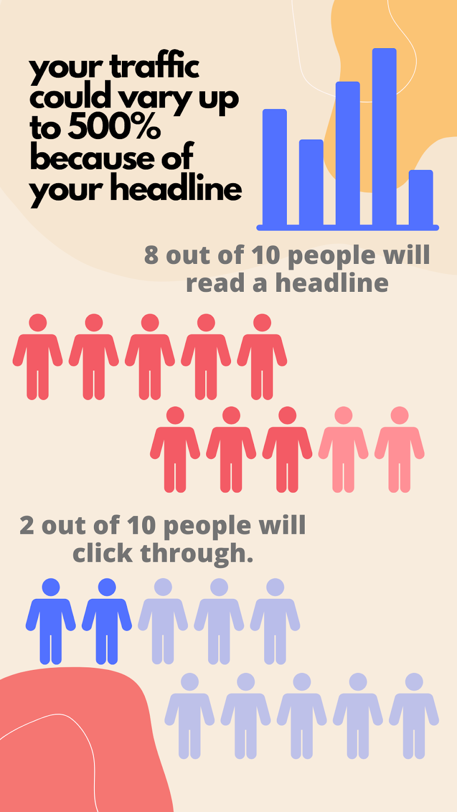
As mentioned earlier, your landing page's headline is a very crucial component of your headline. A headline is where everything begins – interest, attention, and understanding. What should you do with your headline?
Choose A Headline With an Impact
You should craft your headline in a way that compels the visitor to stay and learn more about your offerings. Your headline should be short. Never make it more than 20 words, and it is better to limit it to 10. Here's what your headline should accomplish.
- It should grab the reader's attention
- It should tell the reader what the product or service is all about
Write Engaging Subheadings
Another element you need for a high-converting landing page is the subheading.
If the headline grabs the visitor's attention, the subheading should maintain it. If the headline makes the visitor look, then the subheading should make them stay. When used correctly, these two elements make up a powerful landing page.
Here's what to keep in mind as you create your subheading:
- Normally, the engaging subheadline should be positioned directly below the main headline
- The subheadline should have some element of persuasiveness
- The subheading can be slightly more in-depth in detail than the headline
Let's look at Slack's homepage for example:
The main headline "Where Work Happens", is short, and attention-grabbing. Then in the subheading, visitors are exposed to more details about the platform. Now they know what the platform is about and how it can improve their business.
Sales Copy
A sales copy is a text that persuades readers to buy a particular product or service. A sales copy can be written in paragraph form, list, or as an overlay on an image.
On a landing page, a sales copy is written to persuade a reader to take the desired action on the landing page. How do you write a persuasive sales copy?
Your Sales Copy Should Be Clear And Concise
If your content is confusing, your visitors will bounce. If you ramble on and on, your visitors will bounce. To put it in context, a bounce occurs when a visitor leaves a webpage without taking any action. This is the opposite of what you want to happen on your landing page. High-converting landing pages get right to the point and are easy to understand. Extraneous details can go elsewhere on the website, and high-converting landing pages are focused. To be clear, I'm not saying that landing pages must be short. Include just enough content to achieve your page goal.
Your Sales Copy Should Evoke Emotion
Though we love to think we’re completely rational beings, our decision-making process is almost entirely emotional. Everything we buy has an emotional reason behind it. To evoke emotion, you need to tap into the desires of your audience. Focus on the benefits of your product or service rather than the features. Let them immediately know how they will feel once they purchase your offering and how it will make their lives better.
For example, people don't buy online courses because they have bonus sessions and 40 different video templates. People will buy because they know they might hit six figures in their business or get a better-paying job in a year if they buy. This in turn would allow them to live the luxurious life they always wanted. This is why people buy and this is what you should promote.

Provide A Solution Right Away
High-converting landing pages don't beat about the bush; they know how to respect their visitor's time and provide solutions right off the bat. Do not dwell too much on the user's pain point. Once you have the pain points outlined, offer your solution without delay. Detail what you're offering and focus more on the benefits than the features.
This is not to say you should not mention the features of your product or service. But you should lay more emphasis on the benefits. Be as clear as you can be with your solutions.

Build, test, and iterate on Shopify without the dev time
Replo has hundreds of templates to help you launch and test new landing pages - without writing a line of code.
The Importance Of Calls To Action
A call to action is the most important element of a high-converting landing page. No element is as important as your call to action. No matter how compelling, and concise your sales copy is. No matter how eye-catchy your headline is. Even if you nail the other elements with mind-blowing precision, your visitors would not convert if there's no call to action.
What Is A Call To Action
A call to action (or CTA) is a text prompt designed to inspire the target audience of a marketing campaign to take the desired action. For instance, a call to action can encourage people to click on a link, leave a social media comment, visit an online store, make a purchase, etc.
A call to action can take up different forms:
- Text link
- Button
- Plain text with no link
In the case of a landing page, it is better to use a button. People have been conditioned to expect a CTA in a button. Before we continue, I will tell you three reasons why CTAs are important.
- They motivate your sales funnel. CTAs and sales funnels go well together. The calls to action serve as transitions between the phases of the buyer’s journey. They instruct the user on what to do next, prompting them to take immediate action.
- Customers want them. It will surprise you to know that your landing page visitors are looking forward to your call to action. They want to know what you need them to do after all the catchy headlines and compelling sales copy. Omitting the CTA can confuse readers and hurt your chances of sealing the conversion.
- They boost the success of your digital marketing campaign. This is straightforward if your landing page does not have a CTA, or the CTA is not obvious, people will not convert and your digital marketing campaign will fail.
Loading Speed Matters
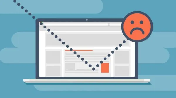
One of the factors that increase the bounce rate of any page is if it loads slowly. If people bounce before they get to see your headline, sales copy, or even your CTA. How then do you get them to convert? The internet is full of much interesting information and the lifespan of your visitor is short. If your landing page is slow and does not immediately serve them all of your landing page content, then they are more likely to bounce.
MultiMedia Elements
Integrating multimedia elements on your landing page is always a good idea. It helps give perspective to your text. Multimedia elements may just be your game-changer, especially when you're trying to sell a product.
Eye-Catching Feature Image
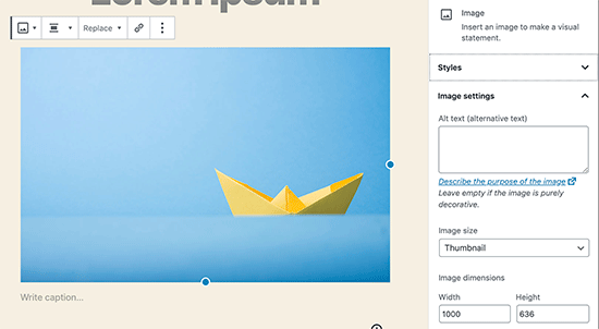
The featured image of a page is the main image of the page. It usually appears at the top of the page before the main body. It is also a part of your page structure. It will be displayed as a thumbnail image next to your page title when the page URL is promoted on social media or search engines.
Featured images are very crucial to the success of your landing page. They are what visitors see even before they click through to your page. You should ensure that your featured image is eye-catchy and capable of igniting the interest of visitors. An eye-catching featured image can increase the click-through rate of your landing page.
Video Explainers
Chances are that you have competitors who are also trying to target a similar audience as you. They may even have a landing page of their own. A creative explainer video could be what sets you apart from them. The more creative your explainer video is, the easier it will be for you to grab people's attention. It also allows you to reveal more detail or even demonstrate the benefits of your product, evoking emotion to a greater degree.
Choose Relevant Images For Your Page
There are several reasons why images can play an important role on a landing page. Here are the top two:
- An image is great at communicating an emotional message: Consider a landing page for a vacation on a beautiful island. An image can get your imagination to run wild "Wow, I can picture myself there."
- It's important to get your message across quickly and clearly. Sometimes images can help visualize something. Humans respond to and process visual data better than any other type of data. Research has shown that the human brain processes images 60,000 times faster than text, which means the first thing your prospects see on a landing page is the image and the colors you use.
The Design Of Your Page
The Design of your landing page plays a role in its success. The following are things to consider when designing a high-converting landing page.
Keep It Simple
One big mistake you can make is to pack as much as you can on your landing page. Sure, you will get a lot of products and information in front of your visitors, but it will be overwhelming and confusing.

Overall Good Aesthetics
Your landing page should be pleasing to the eye to help funnel your website visitors. Using high-quality images can help to achieve this. Remove clutter from your landing page, use visuals sparingly, and use white space. Too many flashing lights and whistles can distract your visitor. Keep them focused on the goal.
Color Theory
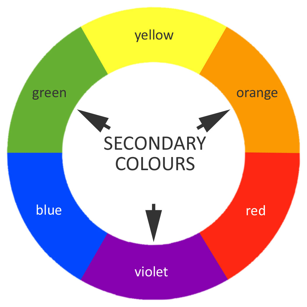
It’s important to take color associations into account in the design of your landing page, but it’s also vital to explore how readable your color choices are. Generally speaking, colors are more readable when they’re on a background that they have a large contrast with (for example, black on white). A high-converting landing page will only be effective when your visitors can understand what it's saying quickly and easily.
The best way to achieve this with color is to ensure that your text and background colors are complimentary, but still contrasting enough for the eye to recognize differences.
The Trust Factor
People will only buy from you, or take the desired action on your landing page when they feel safe. The following is how to infuse the trust factor in your landing page.
Trust Badges And Logos
Trust badges and logos help to reassure your visitors that their sensitive information is with the right brand and is safe. Seeing your logo on the landing page builds a sense of trust, and trust badges help them feel more secure about giving over their information or making purchases with their credit cards.
Social Proof
Humans are both social and risk-oriented beings. By seeing other people have enjoyed the product or service, our doubt fades away. Studies have shown that social proof is not only useful for persuading people to take the desired action; it can increase conversion. People want to know what others are saying about your product or service and how it helped them.
Social proof helps you validate your offer without saying a word, it also helps to foster trust in you and your brand.
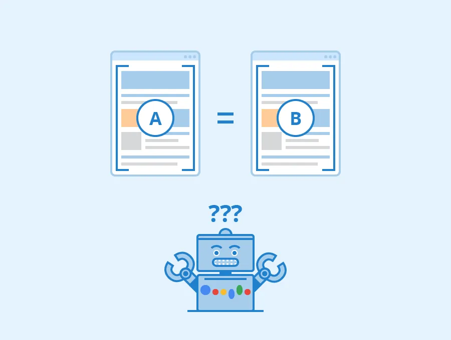
A/B Tests
After you set up your landing page, you want to see metrics and how it is performing. Are there conversions? If not, where are people getting lost?
You want to gather as much information as you can and see if there's any room for improvement. You can create other different design versions from the information you have and test them against each other. This will help you further refine your landing page over time, ensuring you get the best of your visitors and advertising funds.
THE CTA
There are different types of CTAs you might leverage at different points of your marketing funnel. Some of the most common ones are:
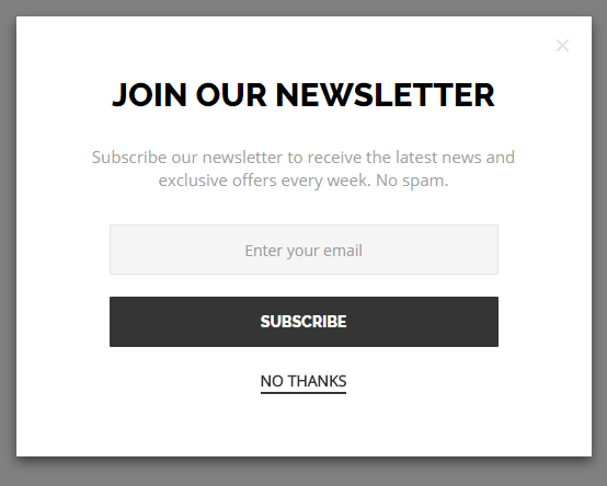
Lead Generation
A lead generation CTA helps to identify viable leads. Whether the prompt is to download a piece of gated content, register for an upcoming event or webinar, or request a quote from the sales team, lead generation CTAs nudge leads to raise their hand and share details that help qualify them.
Click Through CTAs
Lead nurturing campaigns usually have call-to-action buttons designed to get visitors to click. Where these CTAs are found, the goal is always the same; to get visitors to click.
Sales And Signups
In the right place at the right time, calls to action can fuel sales and convert leads into customers. That means targeting leads who are ready to “buy now”—like those who click through to your sales landing page—and using action-oriented language.
To maximize conversions, you should use only one CTA on your landing page. This is an important rule you must not break. If you give your visitors too many options on what to do, they are more likely to do nothing.
Make sure you are not putting anything between your prospects and conversions that makes the process difficult.
Final Verdict: Landing Pages With Replo
It takes a lot of work and thought to put together a high-converting landing page. If you follow all the processes listed in this article, you will have a conversion machine on your hands. However, if this feels too overwhelming and confusing for you, especially for e-Commerce landing pages like Shopify, don't worry we’ve got you covered. It’s understandable that it can take a lot of money and effort. You also may not be able to afford to test landing pages with advertising funds.
What you can do in this case is visit Replo and download pre-built Shopify landing pages. These landing pages were built by experts and have been tested to convert. All you need to do is edit and input your product and service information and watch your conversion rate skyrocket!