12 real pages
Skincare landing page examples
The skincare pages brands send the most Meta ads to, with what each shows on a phone and what we’d change.
Ranked by active Meta ads linking to each page. Page mix: 7 product pages, 3 offer and bundle pages, 1 listicles, 1 quiz pages.
Proof before the product
Bonjout, Mother Science and banu put award badges on the hero image; Jumiso opens on a clinical before-and-after.
Some send the sale to Amazon
Jumiso and numbuzin make the case on their own page, then send shoppers to Amazon to check out.
#1 · Offer page
Kind Science
Over 550 Meta ads linked hereWhy it works
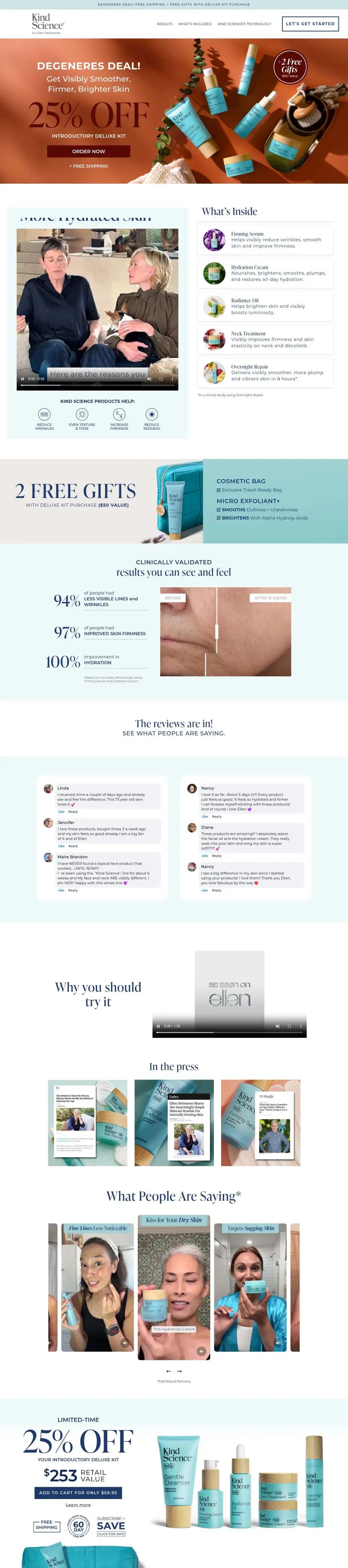
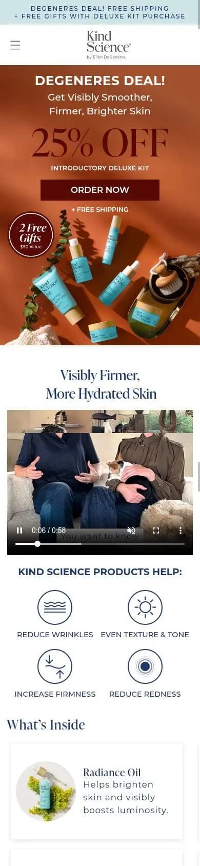
One offer, one button. The first screen names the deal (25% off plus two free gifts), shows the whole kit and puts a large “Order now” button inside the phone screen. The founder’s name does the work a logo bar would.
What we’d change
Show the kit’s dollar price and a star rating next to the button.
#2 · Product page
Jumiso
About 450 Meta ads linked hereWhy it works
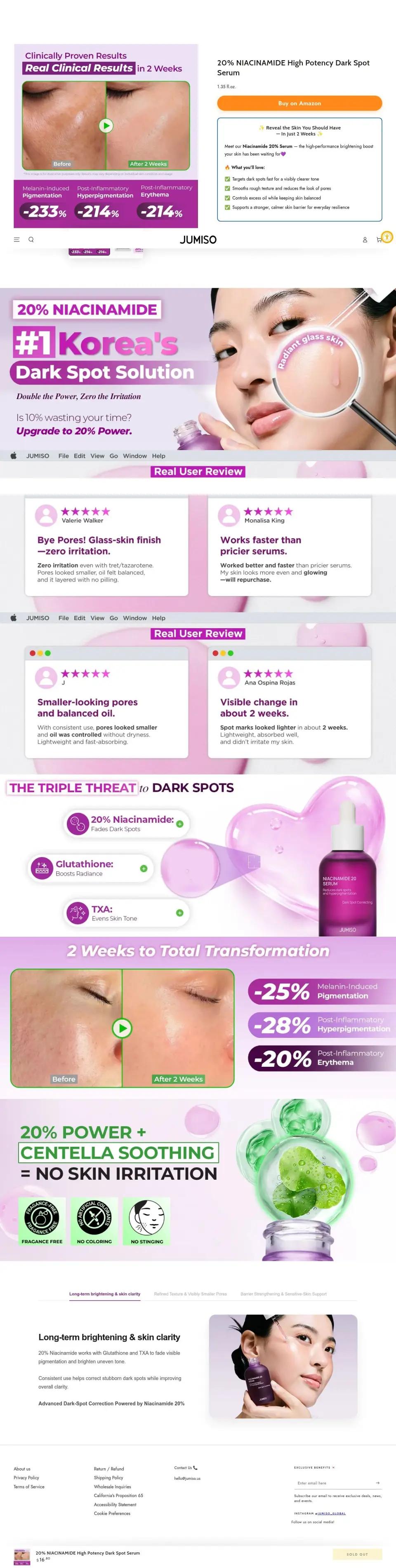
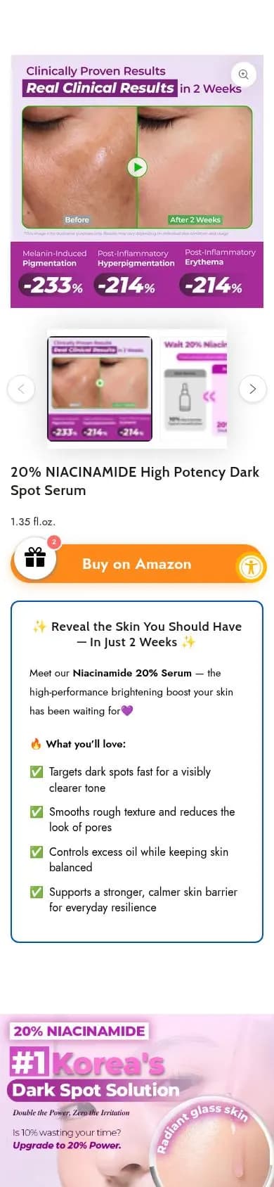
It sells the result before the product: a before-and-after skin video and three clinical numbers lead, then a full-width “Buy on Amazon” button. The buy happens on Amazon, so the page only has to make the case.
What we’d change
Bring the product name and price up; on phones the headline starts far below the first screen.
#3 · Listicle
PAUME
Over 250 Meta ads linked hereWhy it works
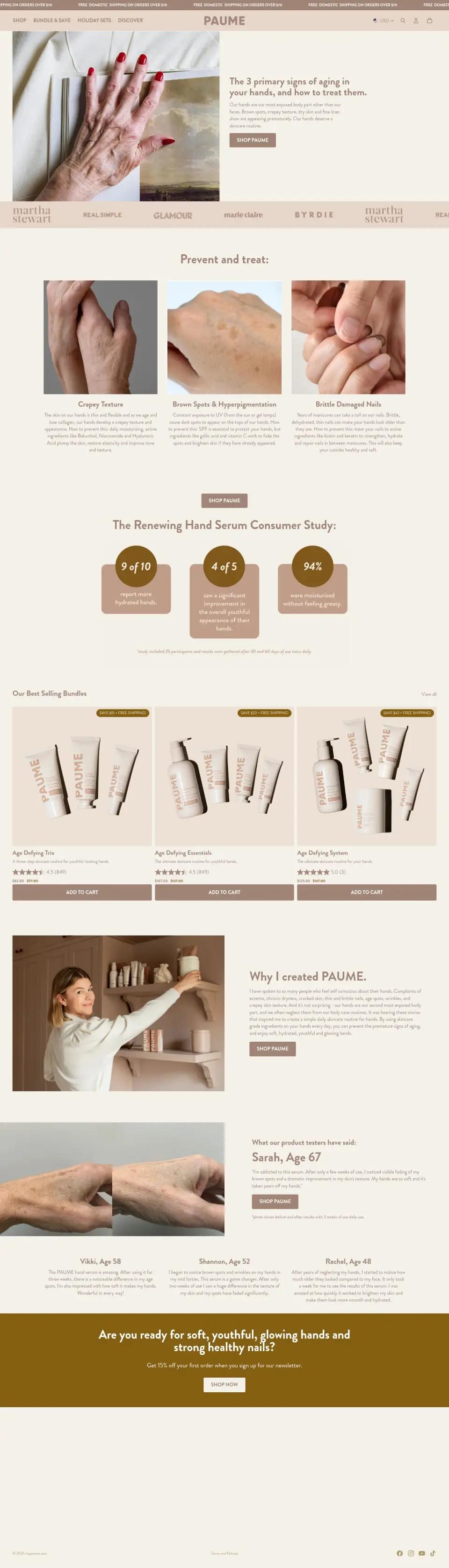
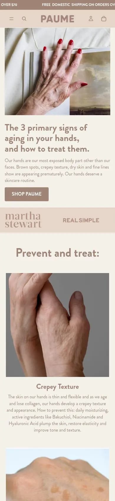
Hand care sold like face care: the headline names “the 3 primary signs of aging in your hands”, Martha Stewart and Real Simple logos sit on the first screen, and the price waits until the case is made.
#4 · Product page
banu
Over 150 Meta ads linked hereWhy it works
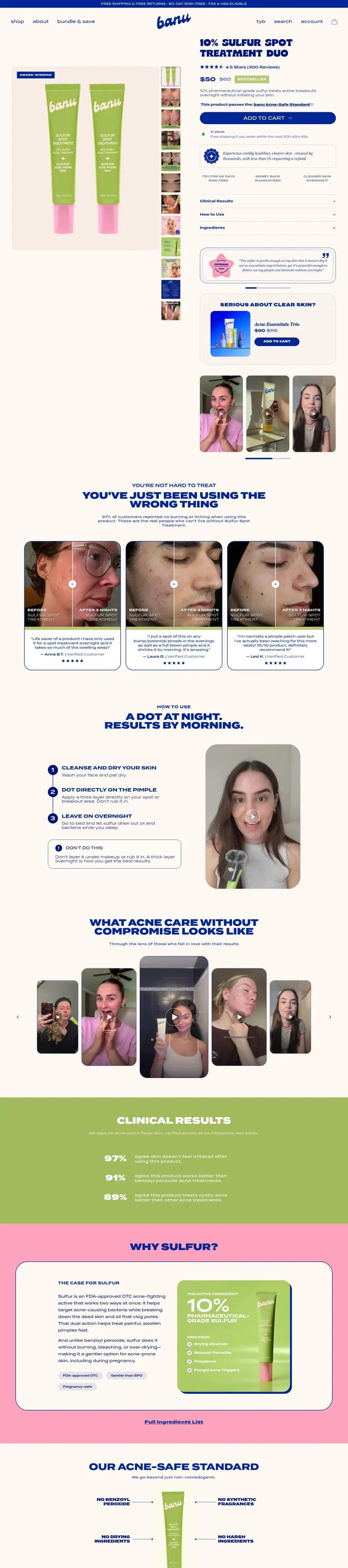
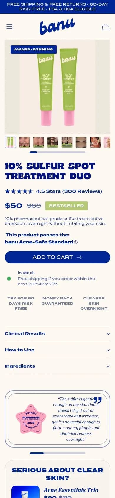
The headline names the active and the dose, “10% Sulfur Spot Treatment Duo”, then a 4.5-star rating, $50 against a crossed-out $60 and a Bestseller tag. Free returns and FSA eligibility in the top bar remove two reasons to wait.
What we’d change
Bring the add-to-cart button onto the first phone screen.
#5 · Offer page
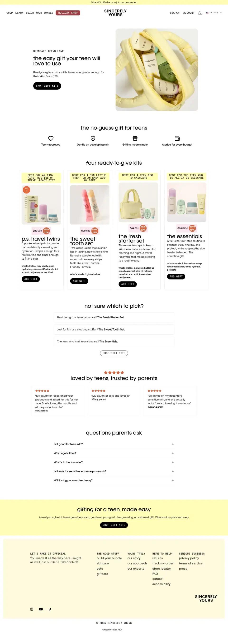
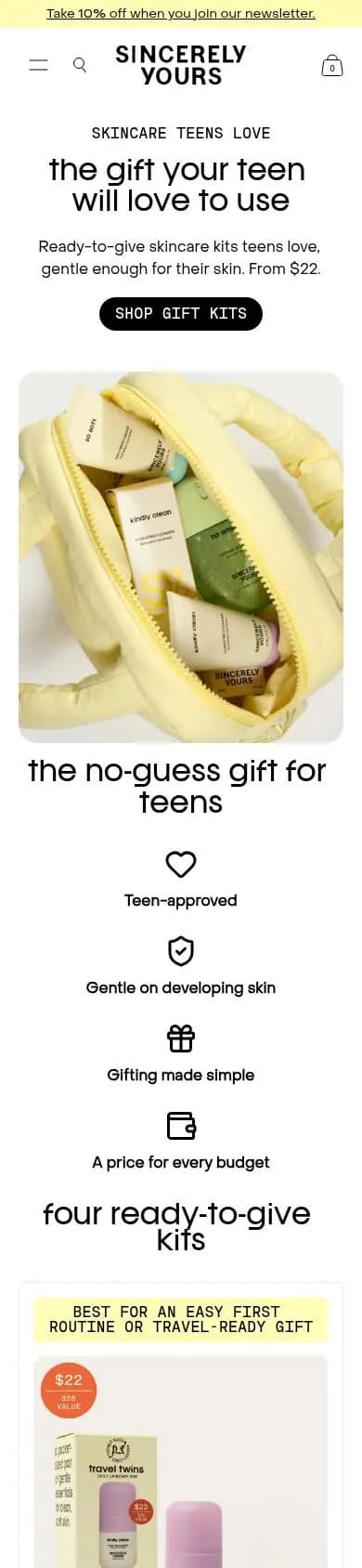
Sincerely Yours
Over 150 Meta ads linked hereWhy it works
It talks to the buyer, not the user: “the gift your teen will love to use”, “From $22” and a single black “Shop gift kits” button. A holiday page for parents, separate from the brand’s teen-facing store.
What we’d change
Add a review count above the fold.
#6 · Product page
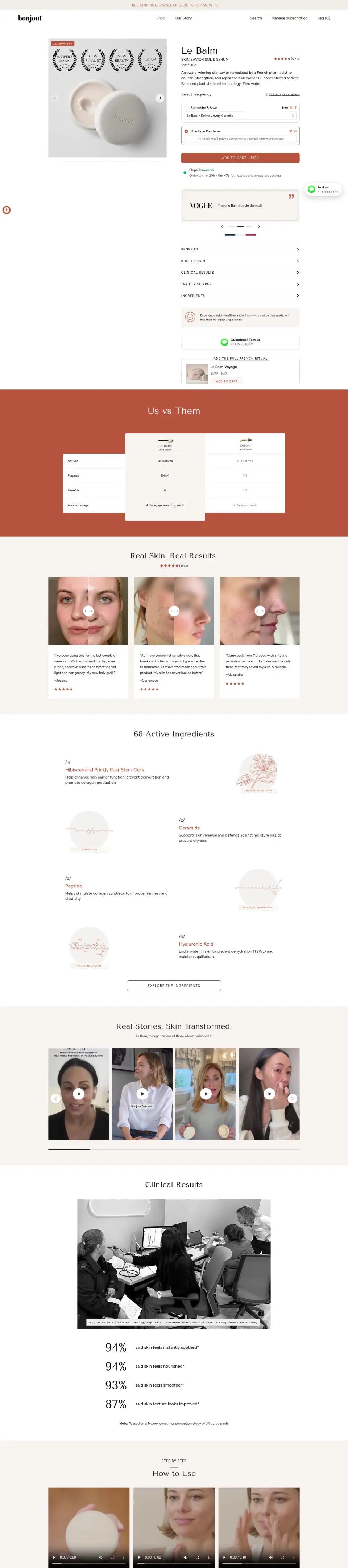
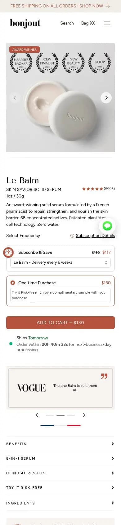
Bonjout Beauty
Over 150 Meta ads linked hereWhy it works
Harper’s Bazaar, CEW, New Beauty and Goop laurels sit on the hero image, then a rating from thousands of reviews and a one-line pitch. Subscribe and save is the default, which suits a balm people reorder.
What we’d change
Show the one-time price next to the subscription price.
#7 · Quiz page
Kushi Beauty
Over 100 Meta ads linked hereWhy it works
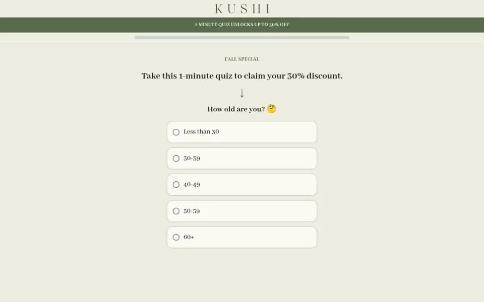
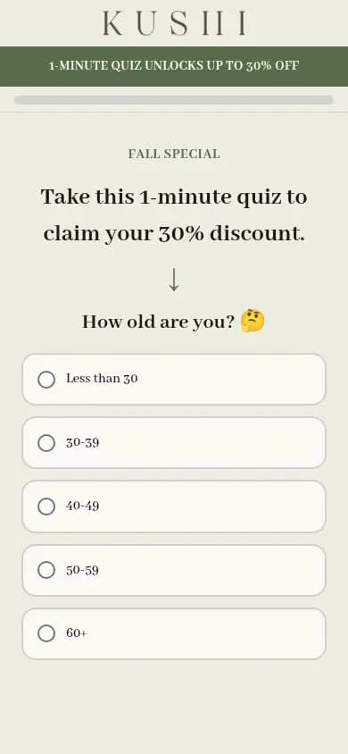
The quiz starts with one easy question, “How old are you?”, and five big answers. The 30% discount promised in the headline is the reason to tap, and the quiz runs on its own subdomain, away from the store.
#8 · Product page
Mother Science
Over 100 Meta ads linked hereWhy it works
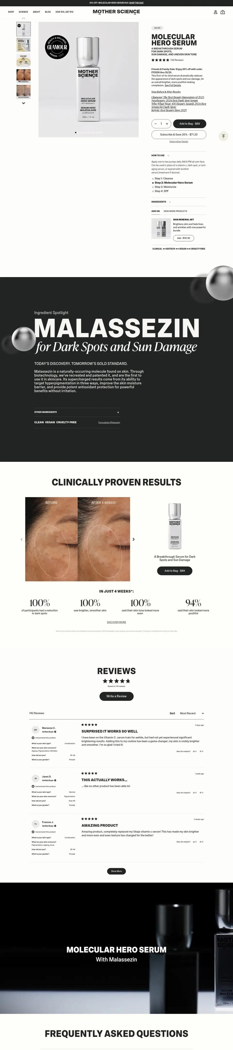
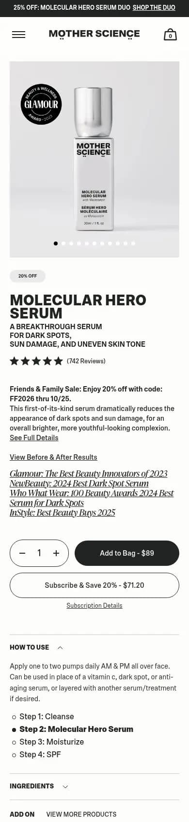
The subhead names three problems the serum fixes (dark spots, sun damage, uneven tone), a Glamour award badge sits on the product shot, and the top bar sells the two-bottle duo at 25% off.
What we’d change
Put the price and the add-to-cart button above the review count.
#9 · Offer page
numbuzin
About 100 Meta ads linked hereWhy it works
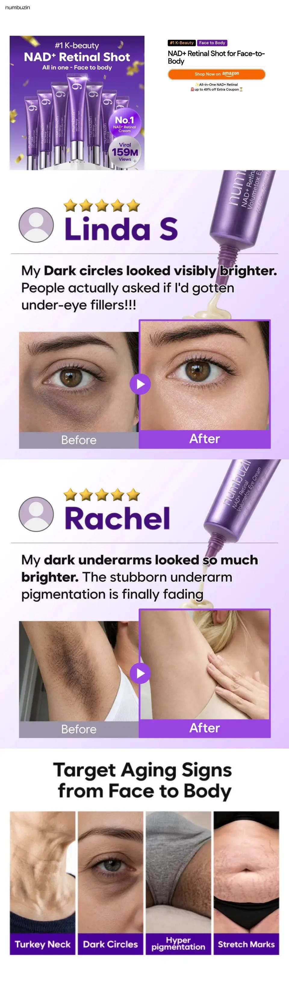
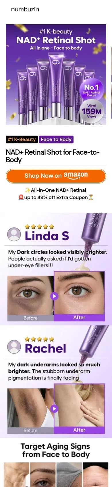
The hero image does the selling: “#1 K-beauty”, “No.1 NAD+ Retinal Cream” and a viral view count sit on the product shot. One orange button sends shoppers to Amazon with an extra coupon, so the page only has to convince.
#10 · Product page
Summer Fridays
Over 90 Meta ads linked hereWhy it works
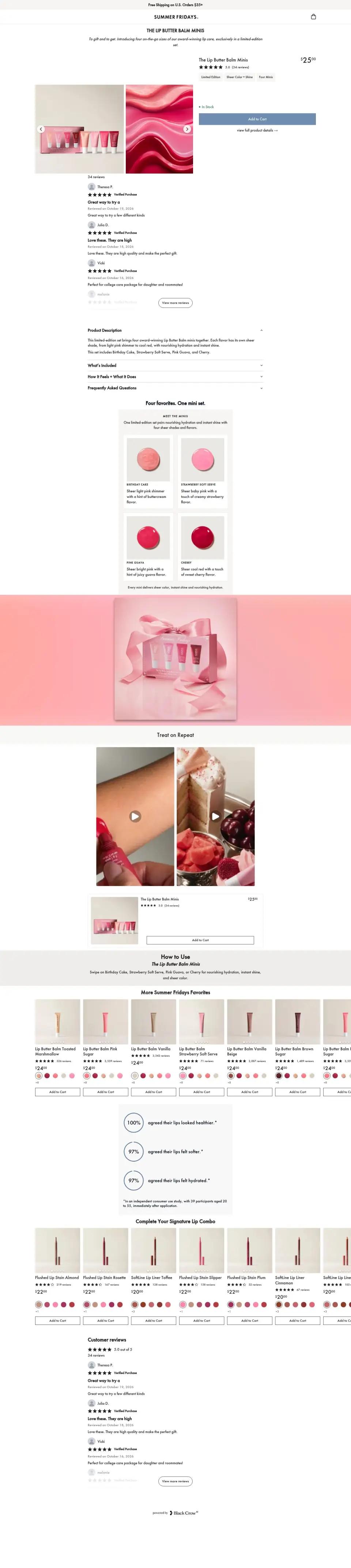
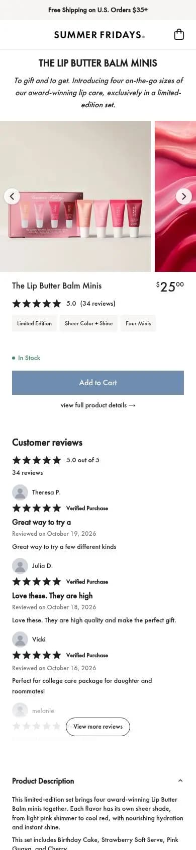
Everything needed to buy fits on the first phone screen: the name, the $25 price and an add-to-cart button across the width. A minis set is an easy first order, so the page doesn’t argue, it checks out.
What we’d change
Make the headline say what the minis do, not just their name.
#11 · Product page
OneSkin
Over 90 Meta ads linked hereWhy it works
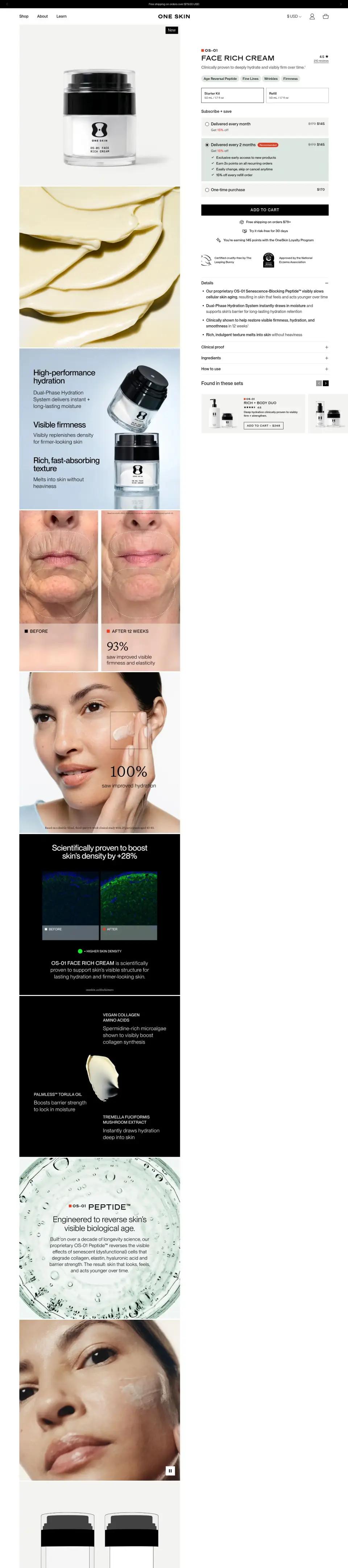
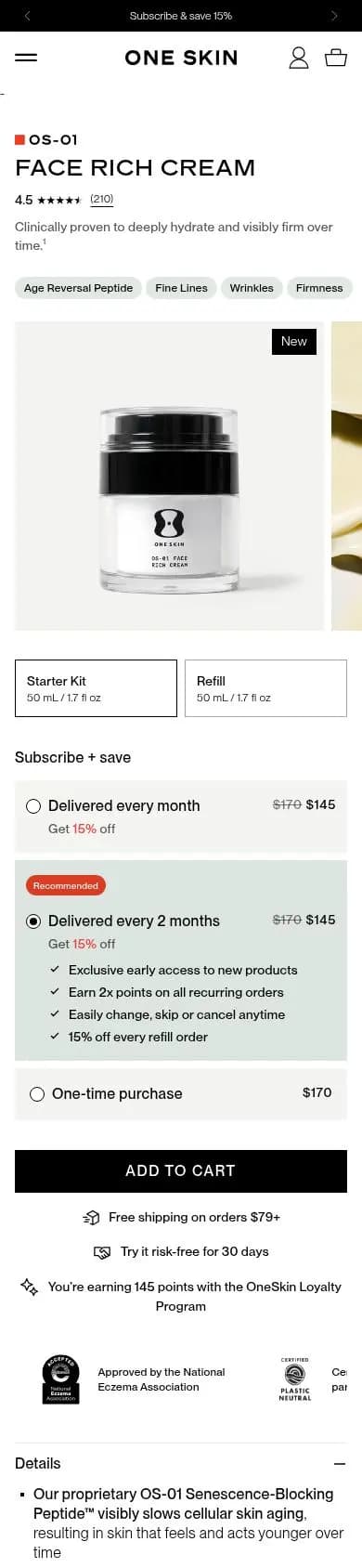
The page leads with the name, OS-01 Face Rich Cream, and a star rating, then short claim tags before the product photo. A clinical layout with few colors fits a brand that sells on science.
What we’d change
Show the price and add-to-cart button before the product photo.
#12 · Product page
Geologie
Over 80 Meta ads linked hereWhy it works
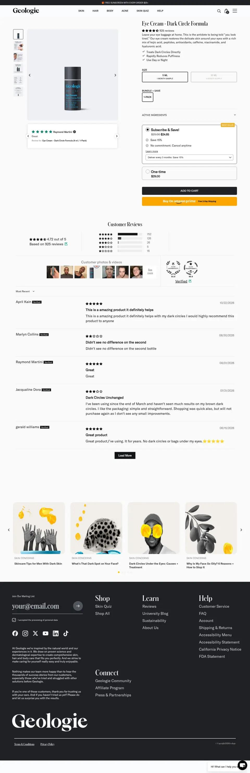
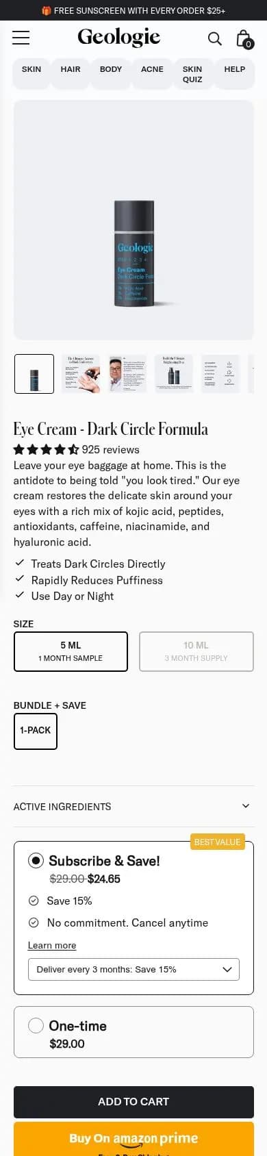
The title names the job, “Eye Cream: Dark Circle Formula”, and the top bar offers a free sunscreen over $25, which nudges a single-item order toward a second product.
Study the ads behind the pages
Brand ads
The Meta ads the biggest DTC brands run, and where they send them.
Top brands
The DTC brands running the most Meta ads, by category.
Ad landing pages report
Which page types top brands send their ad traffic to.
Sales funnels
Real DTC funnels from the ad to the page to the offer.
Landing page design
The design rules behind pages that turn ad clicks into orders.
Templates
Start from a page template and make it yours in minutes.
Skincare landing page questions
- What should a skincare landing page show first?
- The result, the proof and the price. The strongest pages here put an outcome in the headline, an award or rating next to the product, and the price on the first phone screen, so a shopper from an ad can act without scrolling.
- Product page or offer page for skincare ads?
- Both run at scale. Kind Science sends hundreds of ads to an offer page built around a kit, while Jumiso sends hundreds to a product page for one serum. Kits suit a first order; single products suit a hero item.
- Do skincare brands use quizzes and listicles?
- Yes, for products that need a reason to buy. PAUME runs a listicle on the signs of aging in your hands, and Kushi Beauty opens a quiz with one easy question and a discount as the reward.
- How do I build a skincare landing page?
- Describe it to Replo: the product, the offer and who it is for, or click Build a page like this on any page here. Replo builds the page on your brand and publishes it on your own domain, ready for your ads.