18 real pages
Sign-up page examples
Sign-up page examples from 18 software companies, as a new visitor sees them on desktop and phone.
The sign-up pages of the same 20 software companies, minus two that showed a bot check or a blank page; every page captured by us. Ranked by checks passed, out of five, then by the shorter page on a phone.
Common to nearly all
17 of 18 pages offer one-tap sign-up with Google, Apple, Microsoft or SSO.
The usual miss
Only 7 of 18 pages say the account is free or needs no card.
The five checks
One-tap sign-up
A Google, Apple, Microsoft or SSO button shows on the first phone screen.
One field to start
The form asks for an email at most before the next step.
Free said
The page says the account is free or needs no card.
Says what you get
The headline or the line under it says what the product does.
No distractions
No site menu competes with the form, only a logo and log in.
#1 · Work management
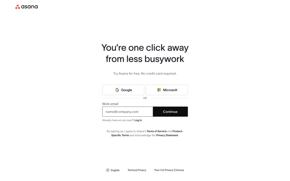
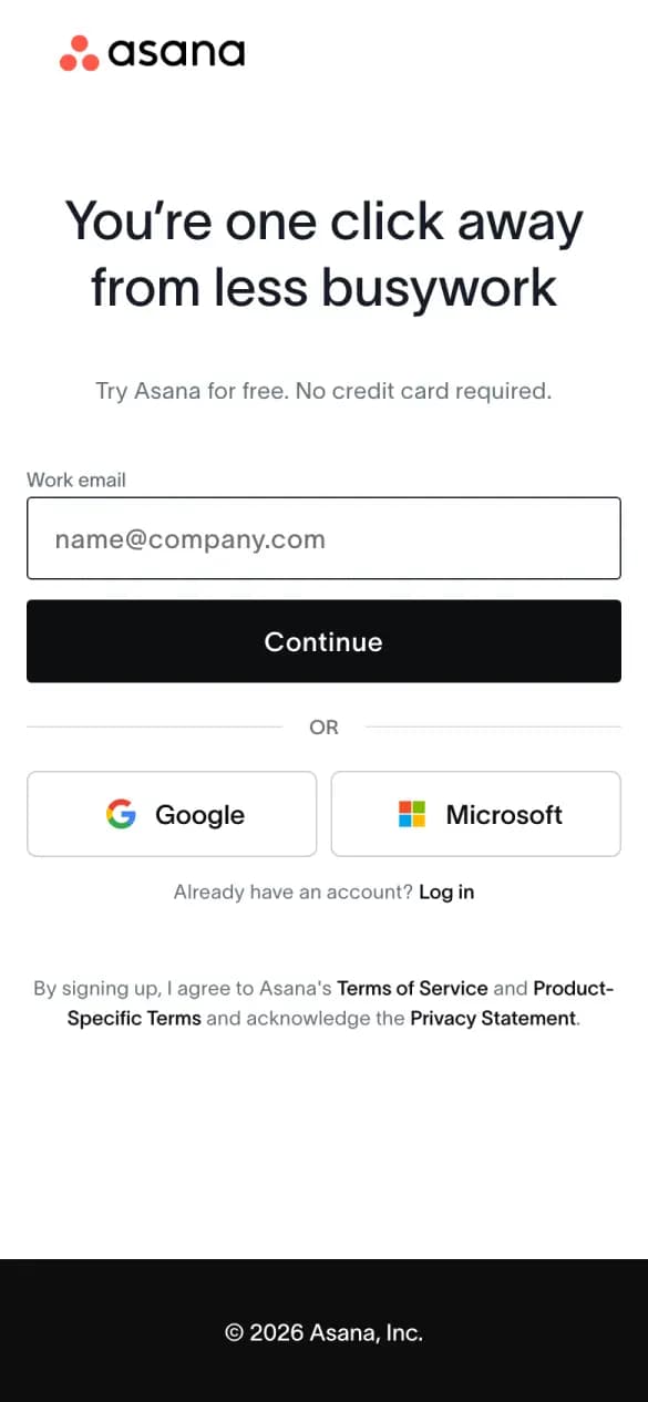
Asana
5 of 5 checks1 phone screens longWhat it does well
Google and Microsoft buttons sit under one email field, with no card needed.
- One-tap sign-up
- One field to start
- Free said
- Says what you get
- No distractions
#2 · Customer service
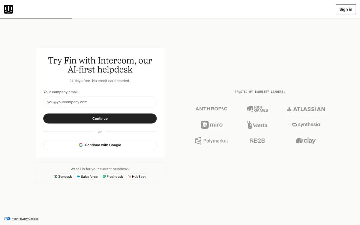
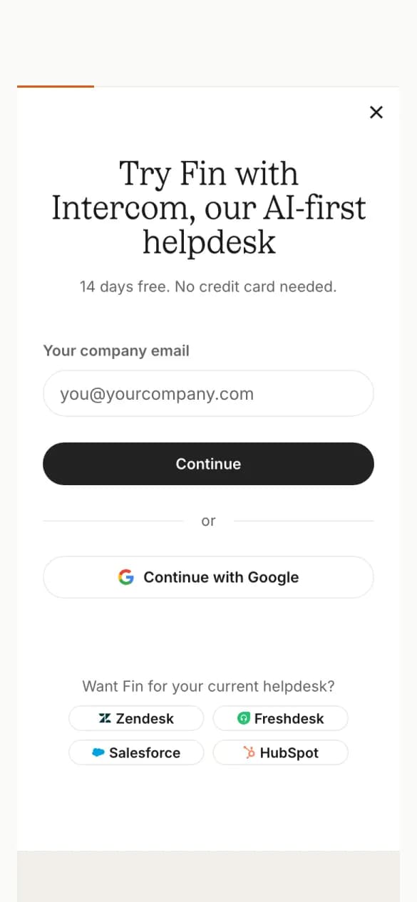
Intercom
5 of 5 checks2 phone screens longWhat it does well
The trial line, 14 days free with no card, sits right above the email field.
- One-tap sign-up
- One field to start
- Free said
- Says what you get
- No distractions
#3 · CRM
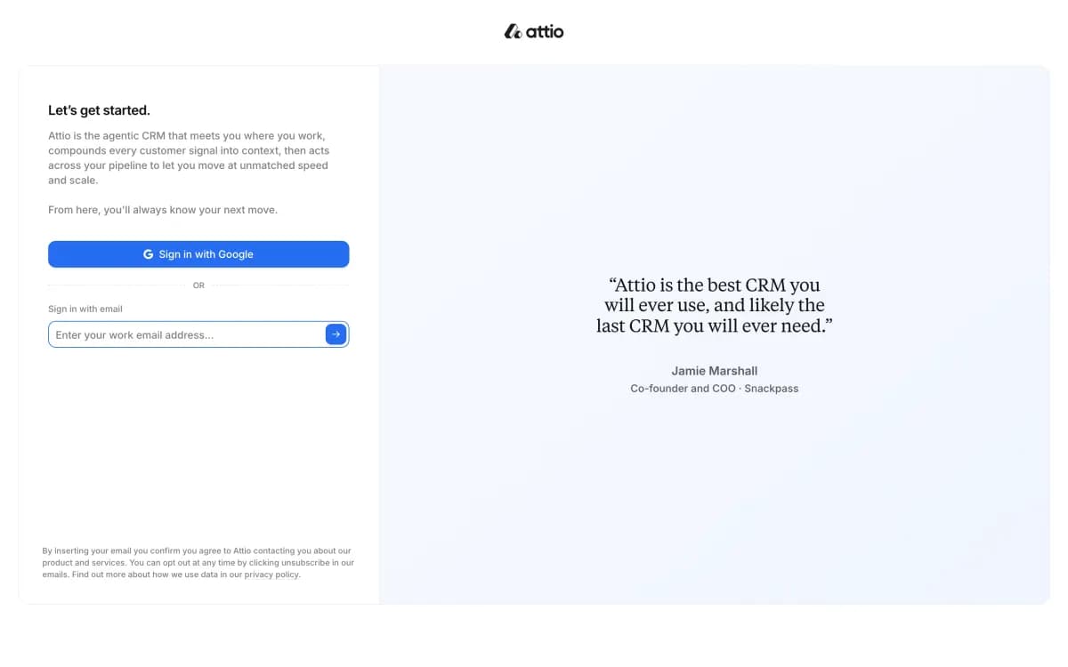
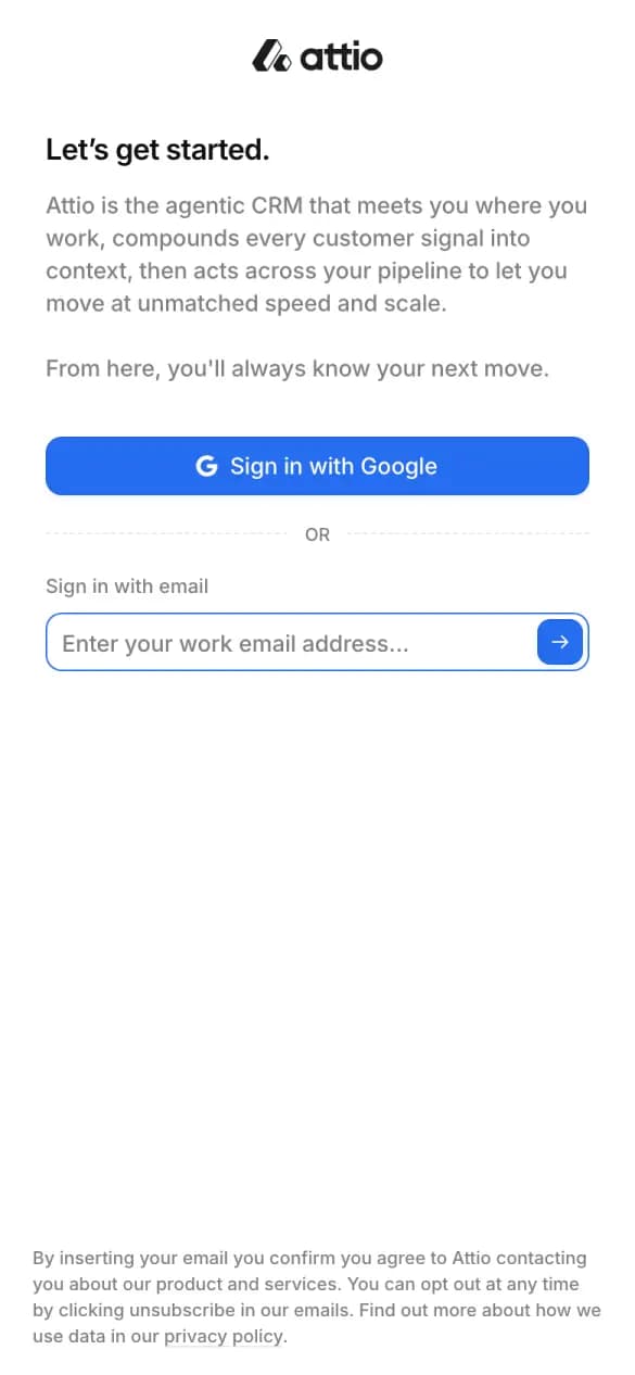
Attio
4 of 5 checks1 phone screens longWhat it does well
A short paragraph says what the product does, above one email field.
- One-tap sign-up
- One field to start
- Says what you get
- No distractions
Misses: free said
#4 · Video messaging
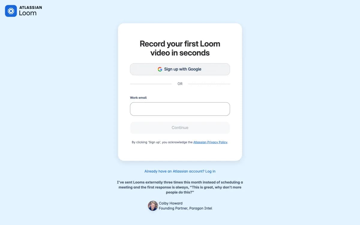
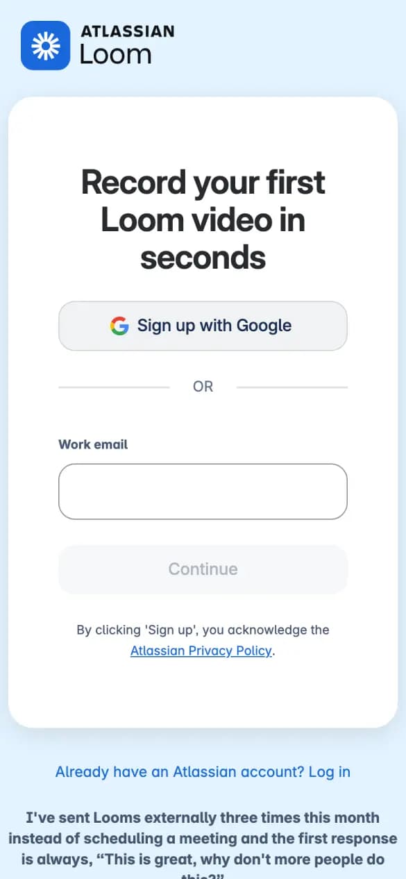
Loom
4 of 5 checks1 phone screens longWhat it does well
The headline promises your first video in seconds, above a Google button.
- One-tap sign-up
- One field to start
- Says what you get
- No distractions
Misses: free said
#5 · Whiteboard
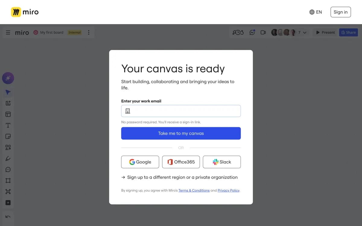
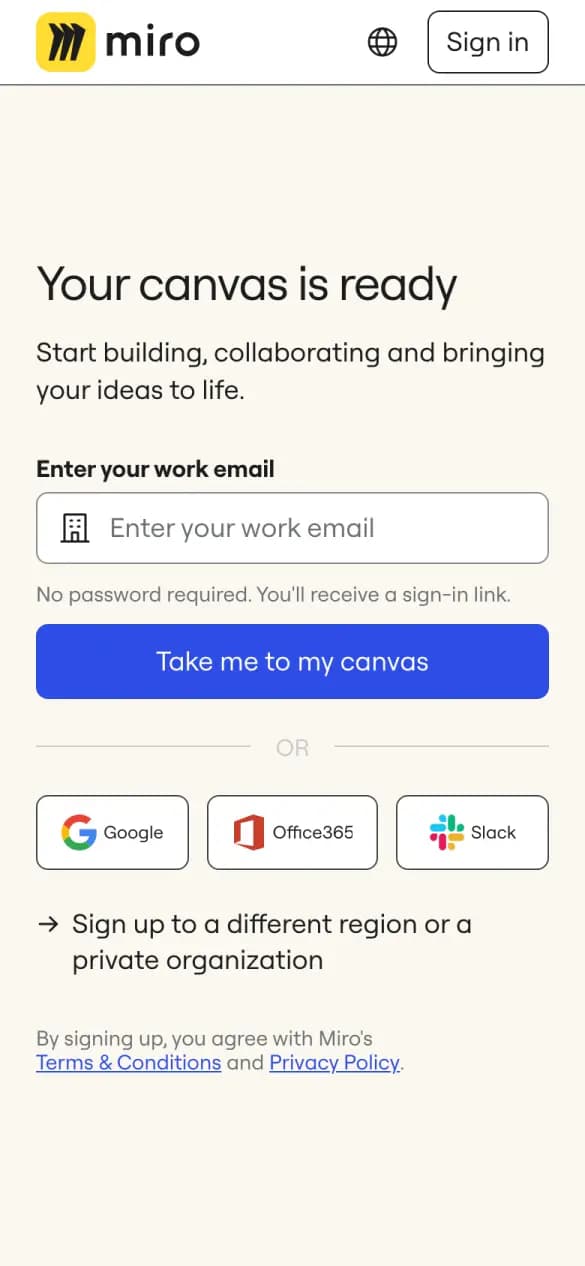
Miro
4 of 5 checks1 phone screens longWhat it does well
A work email gets a sign-in link with no password, plus three one-tap options.
- One-tap sign-up
- One field to start
- Says what you get
- No distractions
Misses: free said
#6 · Workspace
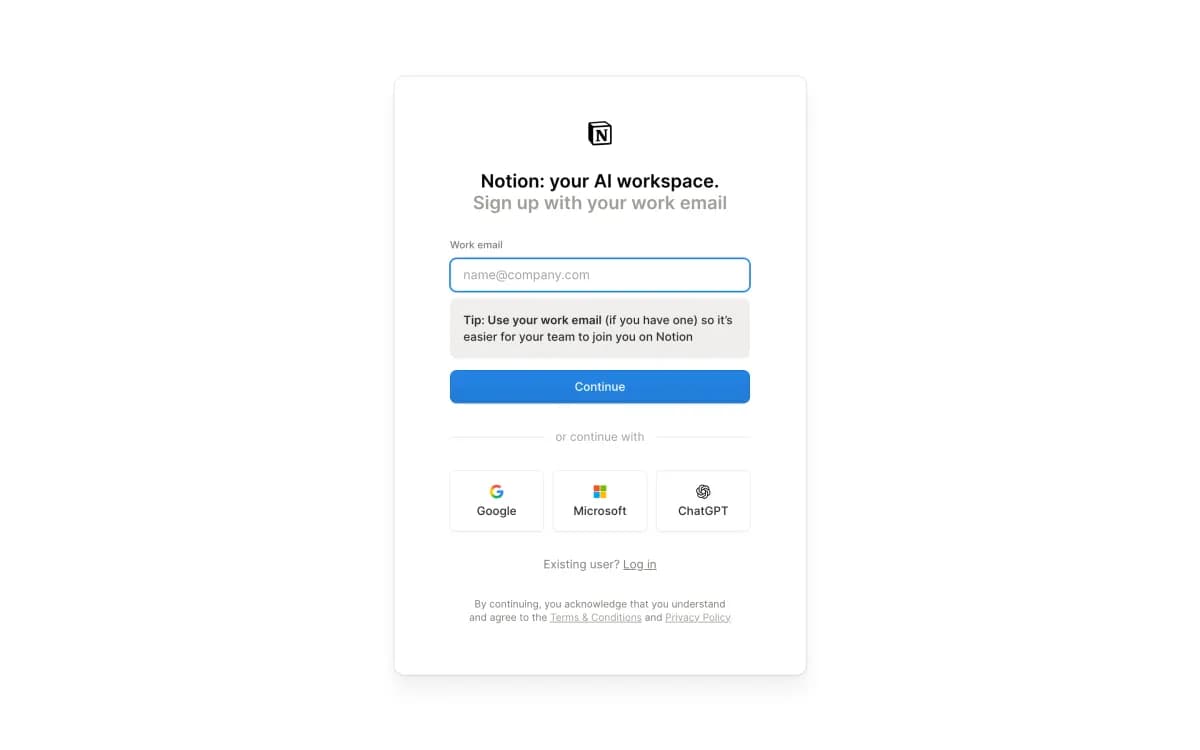
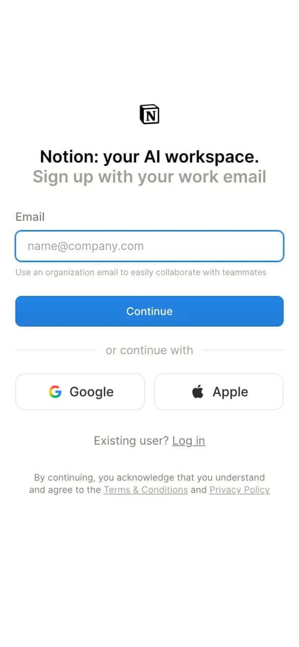
Notion
4 of 5 checks1 phone screens longWhat it does well
One email field, then Google or Apple, with nothing else on the screen.
- One-tap sign-up
- One field to start
- Says what you get
- No distractions
Misses: free said
#7 · Developer platform
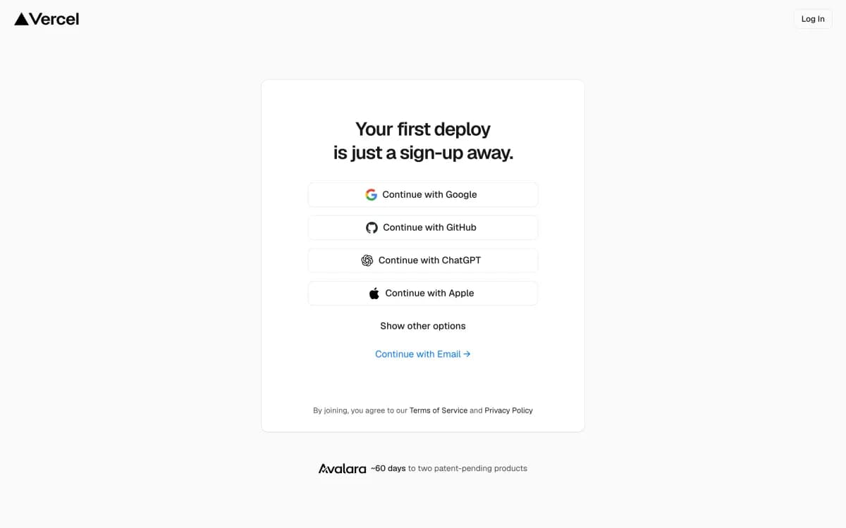
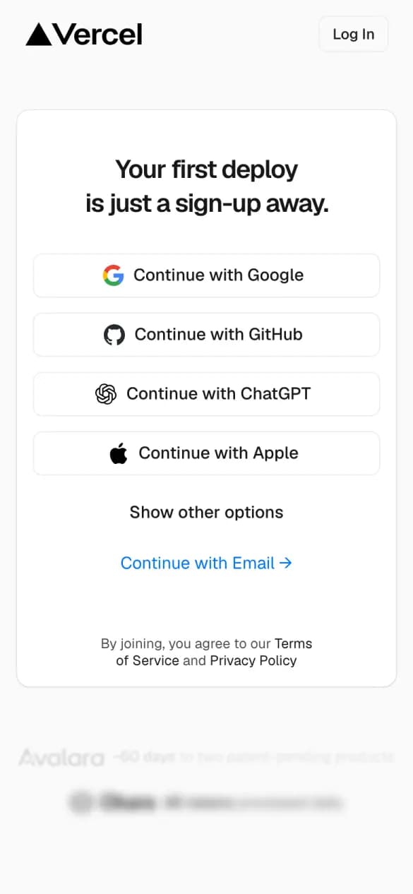
Vercel
4 of 5 checks1 phone screens longWhat it does well
Four one-tap options, GitHub among them, with email tucked behind a link.
- One-tap sign-up
- One field to start
- Says what you get
- No distractions
Misses: free said
#8 · Scheduling
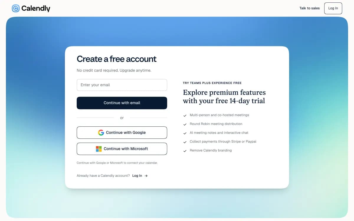
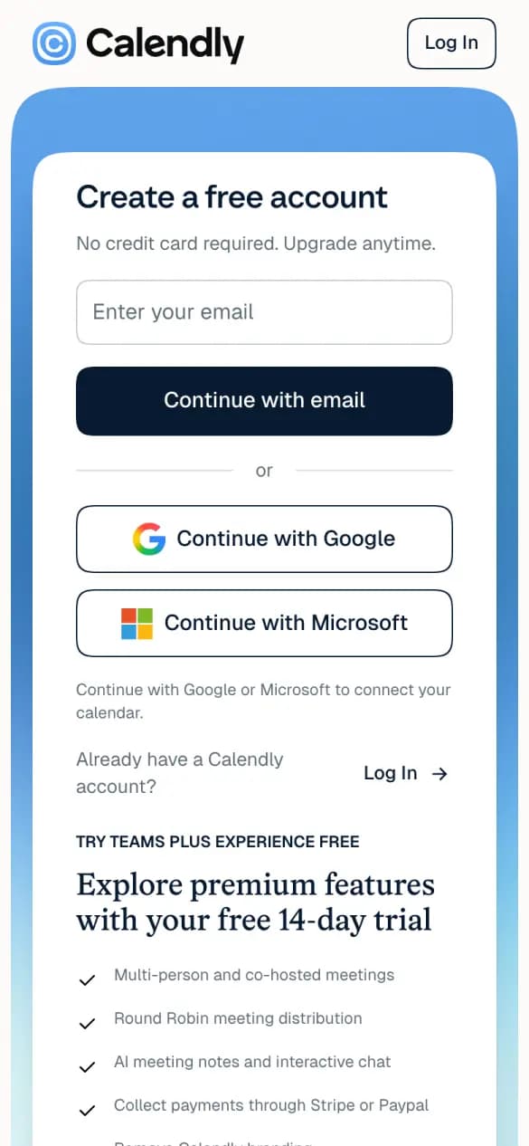
Calendly
4 of 5 checks1 phone screens longWhat it does well
The form says no credit card required, then offers Google or Microsoft.
- One-tap sign-up
- One field to start
- Free said
- No distractions
Misses: says what you get
#9 · Automation
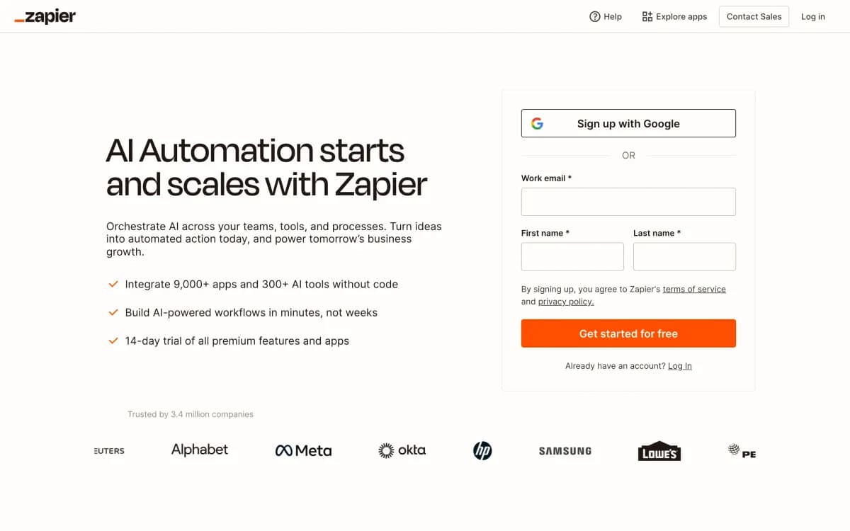
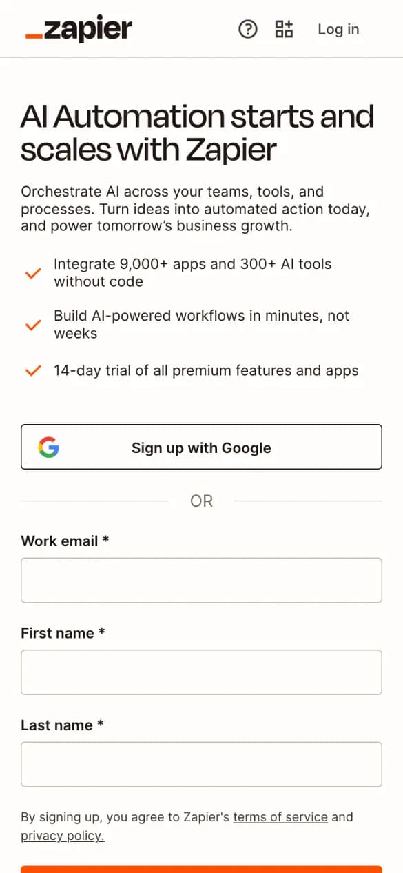
Zapier
4 of 5 checks1 phone screens longWhat it does well
Three short bullets, including a 14-day trial, sit above the form.
- One-tap sign-up
- Free said
- Says what you get
- No distractions
Misses: one field to start
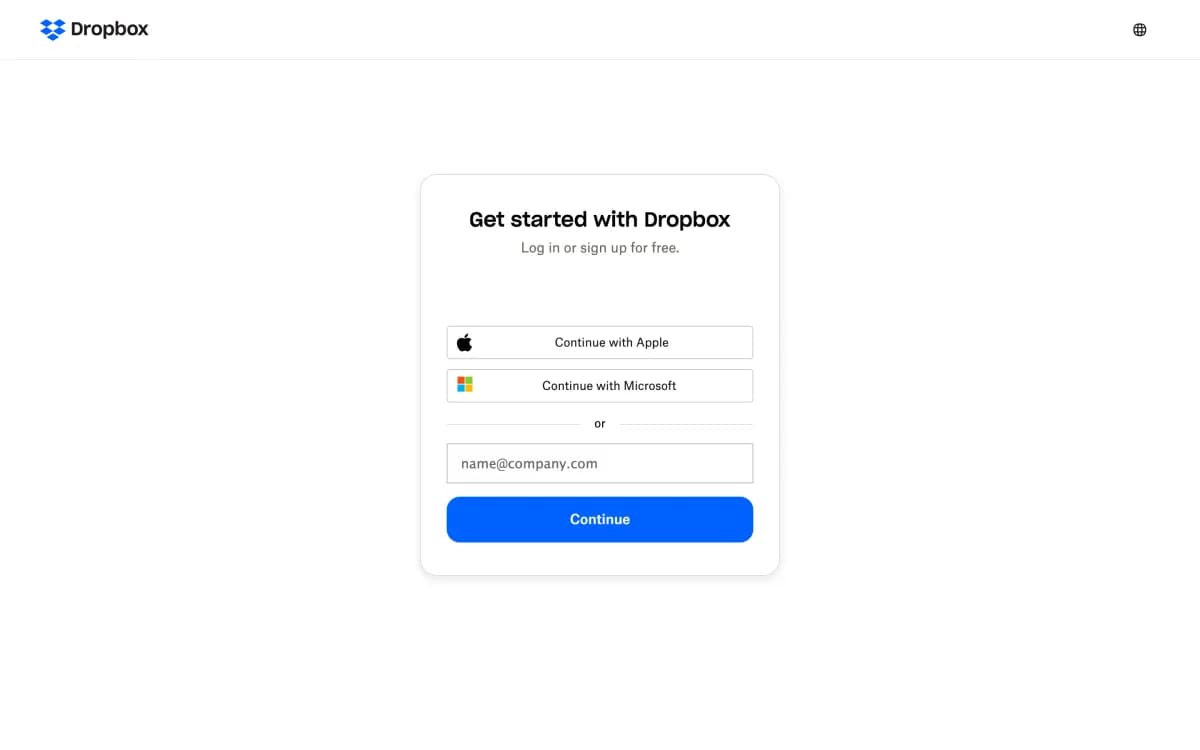
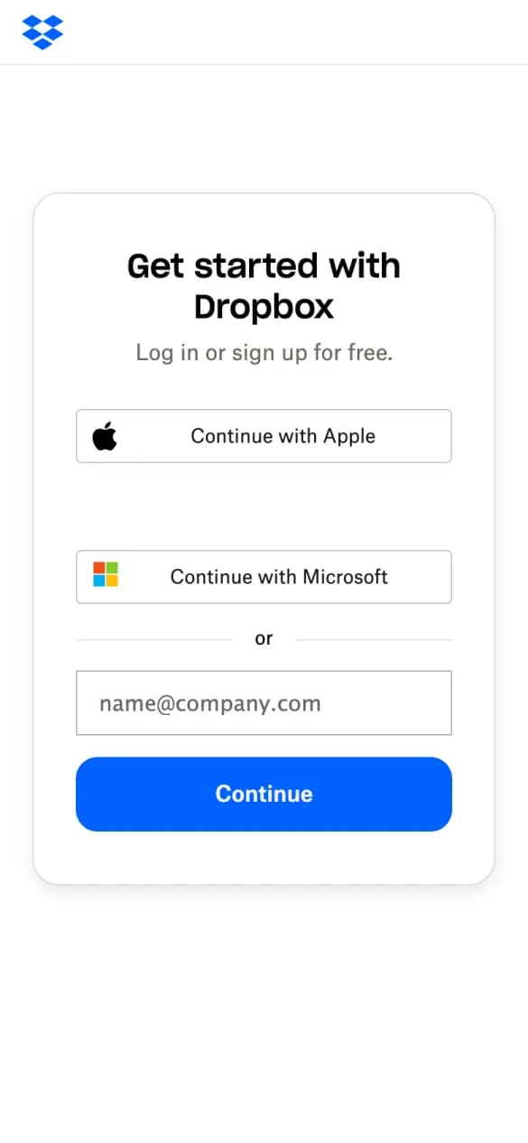
#10 · File storage
Dropbox
4 of 5 checks3 phone screens longWhat it does well
Apple and Microsoft buttons sit above one email field in a centered card.
- One-tap sign-up
- One field to start
- Free said
- No distractions
Misses: says what you get
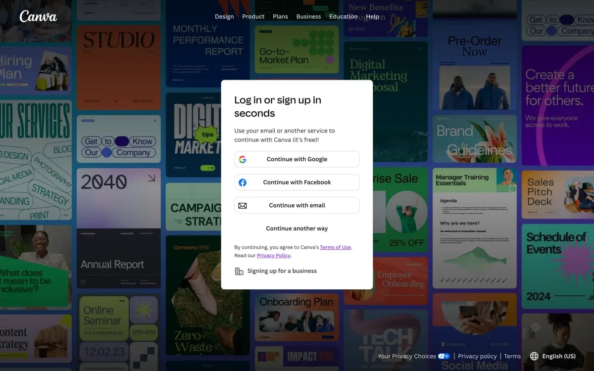
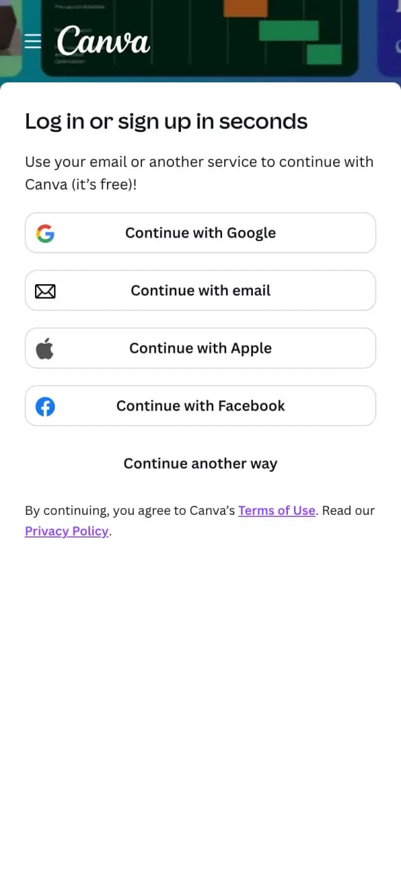
#11 · Design
Canva
3 of 5 checks1 phone screens longWhat it does well
Four one-tap options and a line that says the account is free.
- One-tap sign-up
- One field to start
- Free said
Misses: says what you get, no distractions
#12 · Sales data
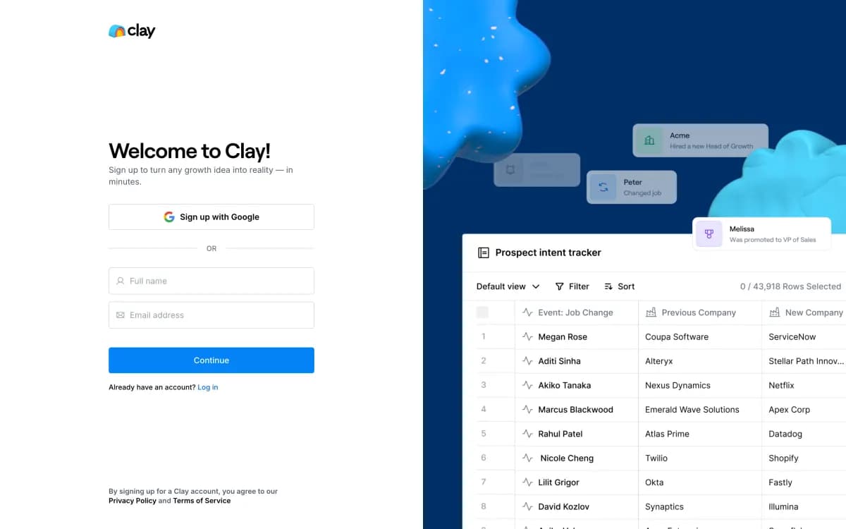
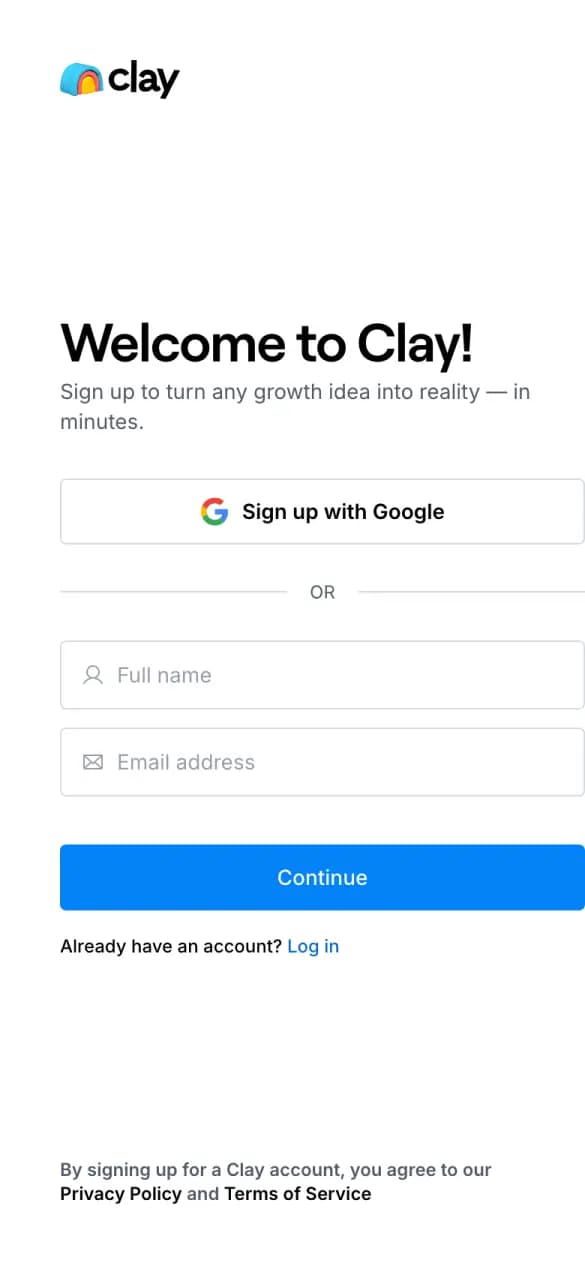
Clay
3 of 5 checks1 phone screens longWhat it does well
A Google button first, then a short form for name and email.
- One-tap sign-up
- Says what you get
- No distractions
Misses: one field to start, free said
#13 · Design
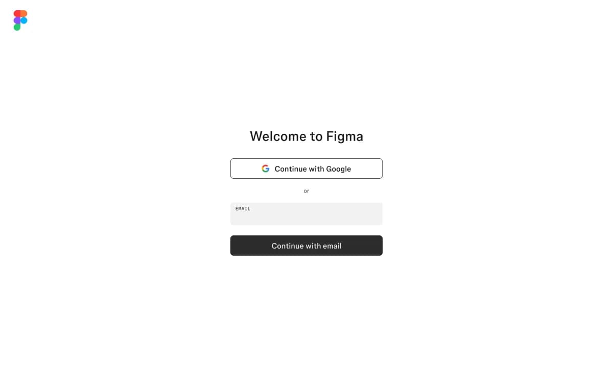
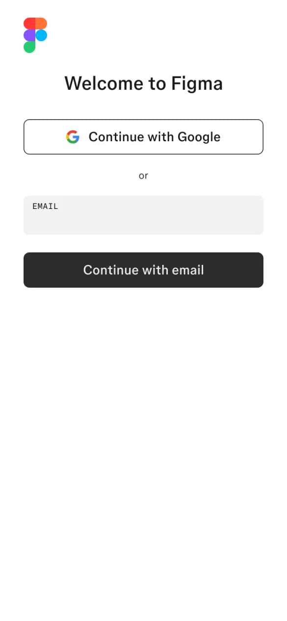
Figma
3 of 5 checks1 phone screens longWhat it does well
Just a Google button and one email field under the welcome line.
- One-tap sign-up
- One field to start
- No distractions
Misses: free said, says what you get
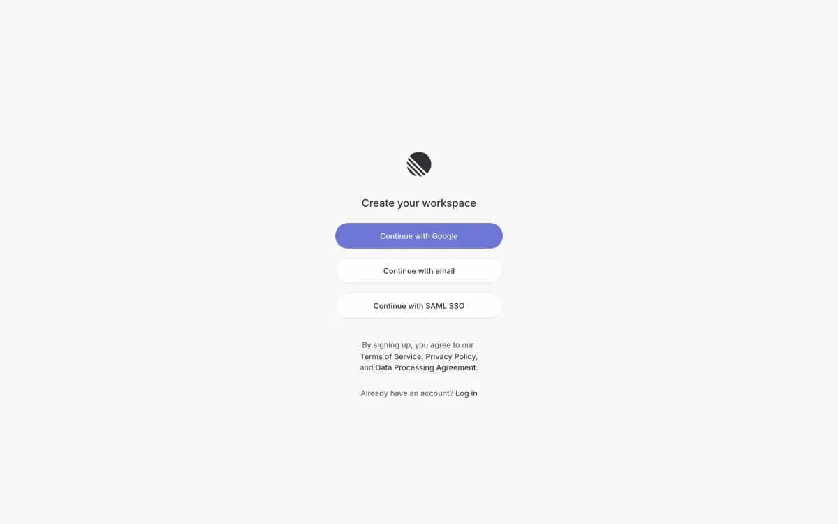
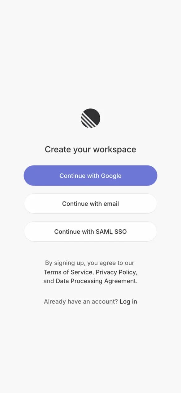
#14 · Project tracking
Linear
3 of 5 checks1 phone screens longWhat it does well
Google, email or SAML SSO, each one tap, with no form on screen.
- One-tap sign-up
- One field to start
- No distractions
Misses: free said, says what you get
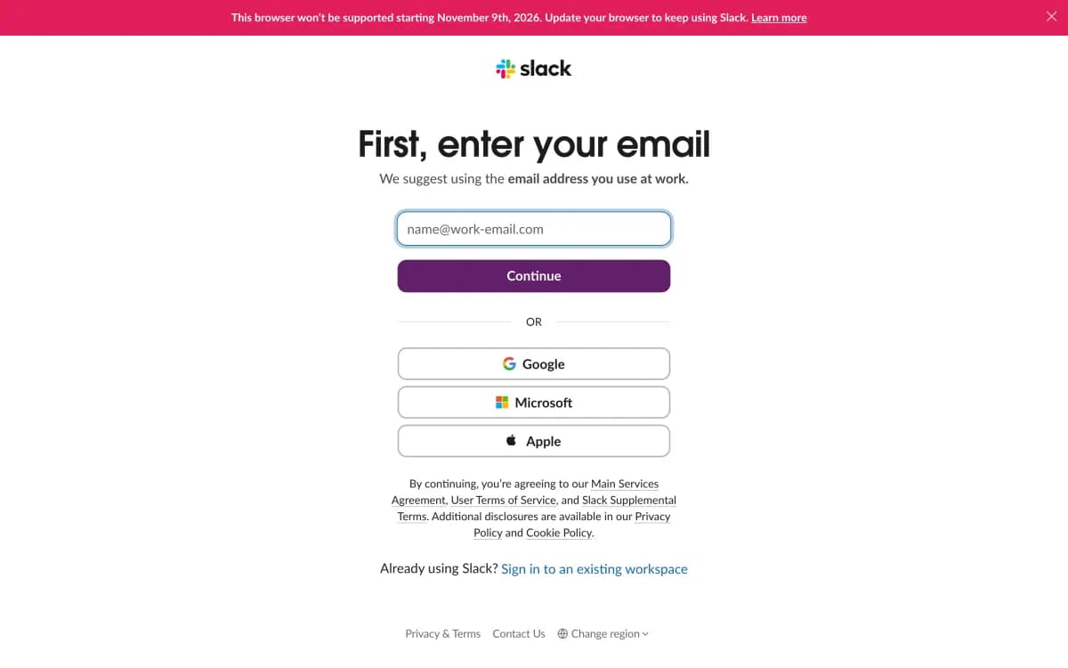
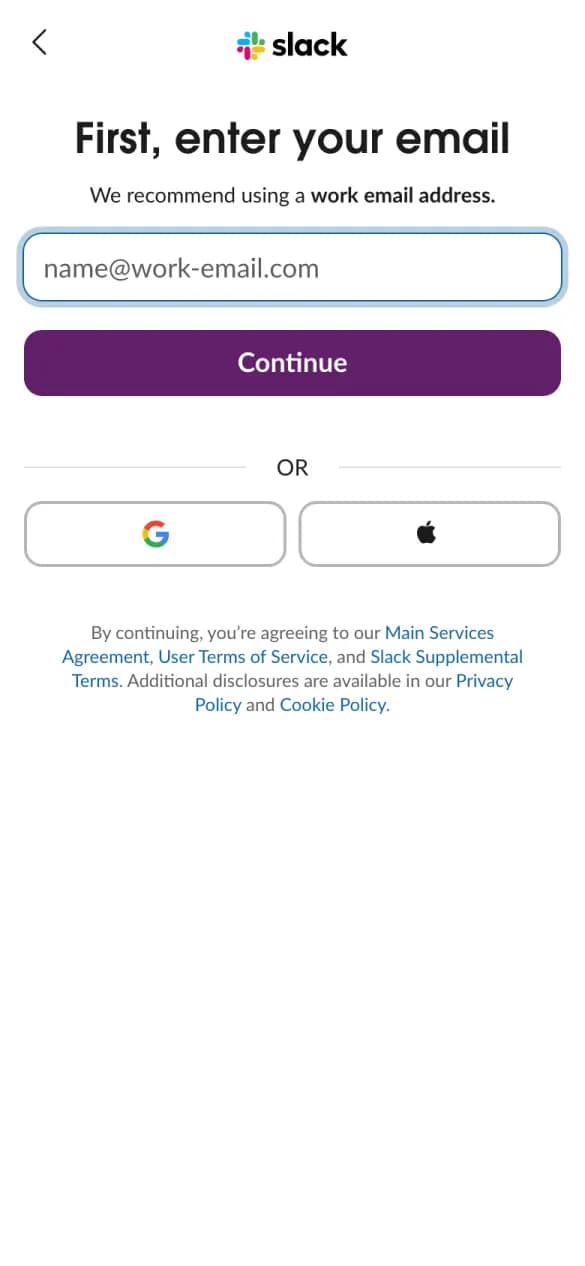
#15 · Team chat
Slack
3 of 5 checks1 phone screens longWhat it does well
One email field with a work-email tip, then Google or Apple.
- One-tap sign-up
- One field to start
- No distractions
Misses: free said, says what you get
#16 · Email marketing
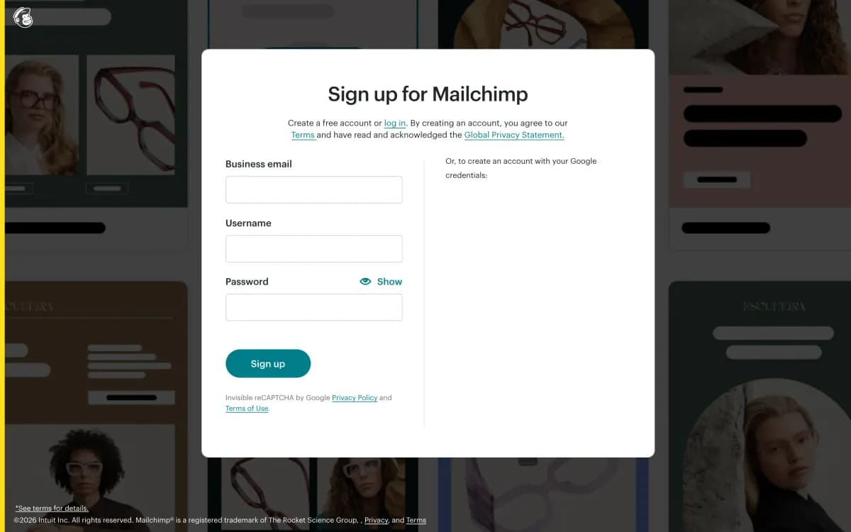
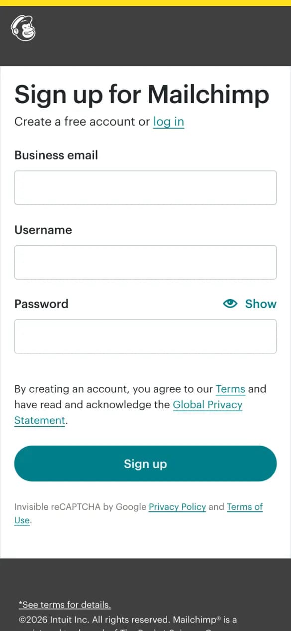
Mailchimp
2 of 5 checks1 phone screens longWhat it does well
The headline says the account is free, though the form asks for three fields.
- Free said
- No distractions
Misses: one-tap sign-up, one field to start, says what you get
#17 · Spend management
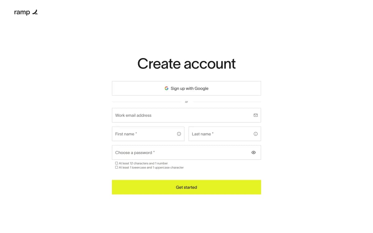
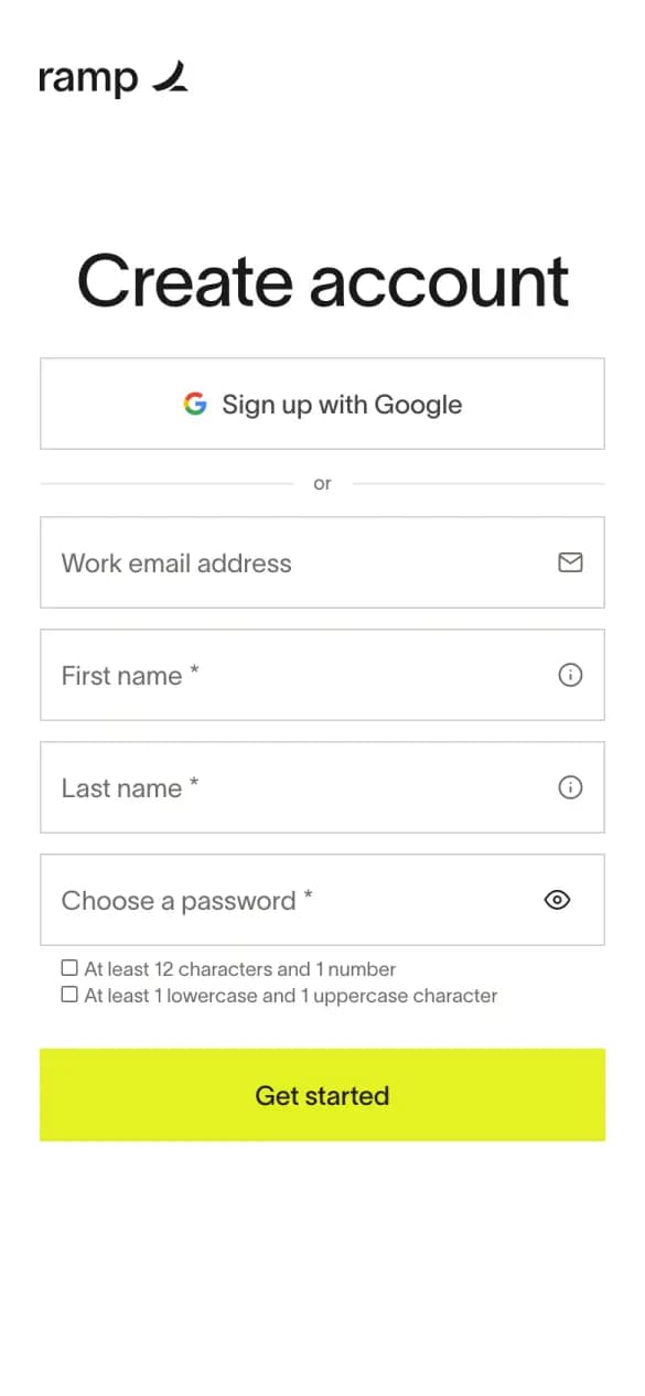
Ramp
2 of 5 checks1 phone screens longWhat it does well
A Google button sits above a short form for email, name and password.
- One-tap sign-up
- No distractions
Misses: one field to start, free said, says what you get
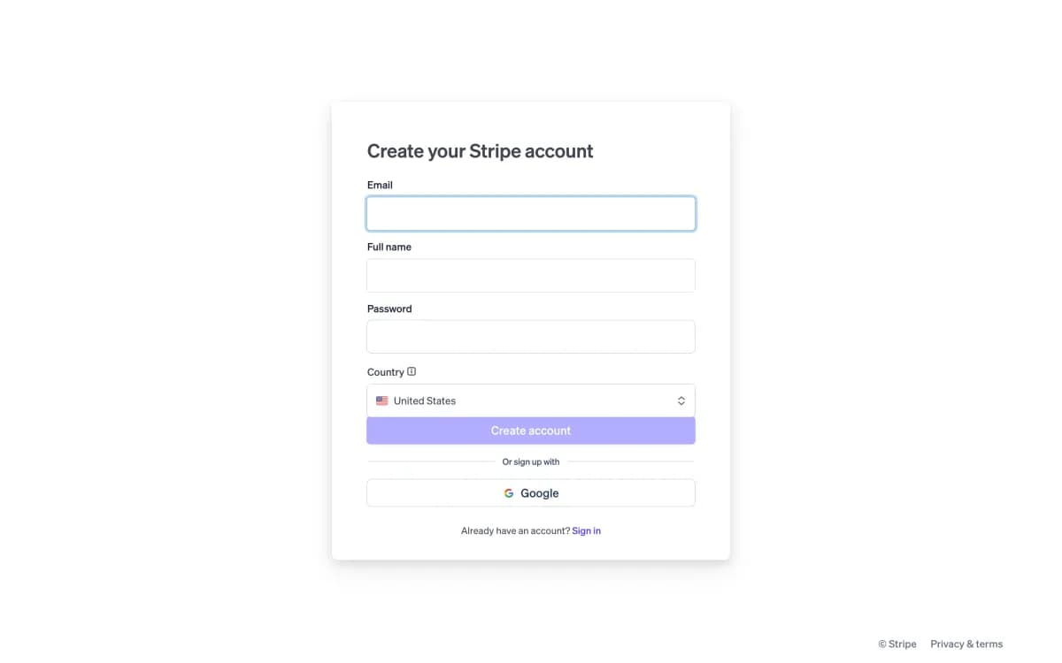
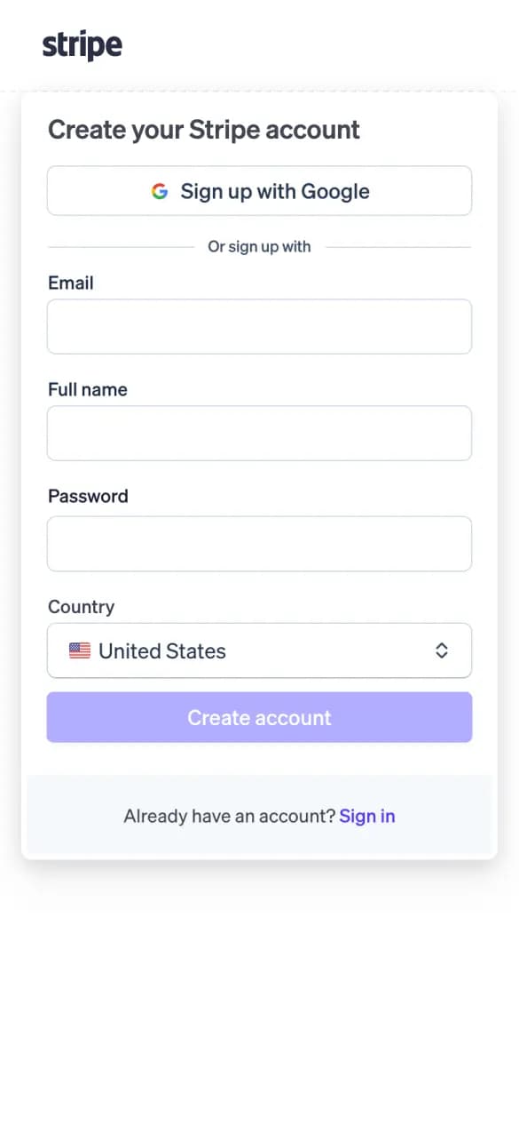
#18 · Payments
Stripe
2 of 5 checks1 phone screens longWhat it does well
A Google button sits above a form that also asks for your country.
- One-tap sign-up
- No distractions
Misses: one field to start, free said, says what you get
Build it, then learn what converts

Sign-up page questions
- What makes a good sign-up page?
- One-tap sign-up, a single email field, a line that says it's free, a reminder of what the product does and nothing else to click. Asana and Intercom do all five on the first phone screen.
- How many fields should a sign-up form have?
- One to start. 13 of the 18 pages here ask only for an email first and collect names and passwords later. Mailchimp, Ramp and Stripe, which ask for more up front, score lowest.
- How do I build a sign-up page like these?
- Click Build a page like this on any example. Replo opens with a prompt for that layout, ready for your product and brand, and publishes it on your own domain.